The last PPC campaign I analysed in the ‘Analyse A Real PPC Campaign’ was from YorkTest, who had an example of a PPC campaign that was too vaguely targeted, which would result in YorkTest both paying too much per click when they do get a click, as well as attracting traffic that might not be targeted enough to gain a good conversion for a healthy return of investment.
With it being the start of December, something that the vast majority of people will be looking to buy is an advent calendar, in the run up to Christmas be it for themselves or someone else. With this, here is an analysis of a PPC campaign from Lindt.
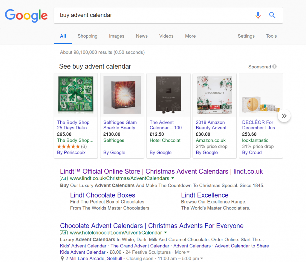
To view Lindt’s PPC search advert, I had to type into Google search UK, ‘buy advert calendar’:
It is also clear Lindt is a luxury chocolate brand. They have used this to their advantage, by having a very high brand name density throughout the whole advert.
After clicking on the above advert, I came to the following landing page:
Putting this side, the design is nice and has a Christmas feel to it, which of course is important. It would have been good to see the range of advent calendars Lindt have on offer, so that it is immediately apparent to the web user that they have a choice other than the two that are shown in the image. As well as this, the use of social media buttons are a great way to add exposure to a landing page. However, when the Facebook ‘Like’ button has zero likes, it does not send across the best message to the web user – for landing pages such as this, social media buttons are a great addition. But, only add numbers to the buttons if they show off the page as very popular.


