The last PPC campaign I analysed in the ‘Analyse A Real PPC Campaign’ series was from Oxfam, who had both a good search advert and landing page – the navigation menu was particularly good on the landing page since it enabled web users to explore all of the products Oxfam had to sell in different categories, as a charity.
An area that is fiercely competitive is the online industry. With this, here is an analysis of a PPC campaign from KLM.
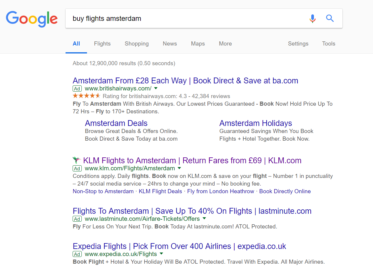
To view KLM’s PPC search advert, I had to type into Google search UK, ‘buy flights amsterdam’: As predicted, competition is fierce for this search phrase, with the maximum of four adverts appearing. The CPCs for such a keyword search phrase is also likely to be very likely, since the conversion rate for such a search phrase is likely to be high, worth at least $50-$100+. Due to this, KLM have done well to rank #2 on paid search results.
Looking at the advert itself, the advert has good and bad points associated to it:
- The title has been well optimized. It addresses what the search phrase, includes a price for the service, as well as a URL for brand awareness and to promote direct traffic.
- Although it is good KLM mentioned a price for their flights, it poses the risk of being quantifiably compared to other search adverts, if they show their prices too. In KLM’s situation, this is the case where British Airways is seemingly cheaper. For this reaosn, it is only advised to include numbers when you know you can compete and beat the prices of your competitions in PPC.
- The description contains stop/start sentences to fit in as much content as possible. There is a call to action in the description which should aid a healthy CTR. However, it would have been better to stick the ‘Conditions apply’ at the end of the description, since the start of the description is more likely to get more exposure than the end.
- The site links extension is used. Some of the links are well chosen. However, I feel the middle two could have related a little more to what the web user searched for.
After clicking on the above advert, I came to the following landing page:
- The landing page is very minimalist, pushing the attention to the question and blue box links for each month.
- It is not possible to scroll down the page, so that the exposure of the question and links are maximized.


