The last PPC campaign I analysed in the ‘Analyse A Real PPC Campaign’ series was from BT Mobile, who had an effective search advert, albeit the fact that they were ranked the lowest of the paid search results. The landing page was significantly poor, with many areas of improvement to get a conversion from the web user. Continuing the mobile sector, here is an analysis of a PPC campaign from Giff Gaff.
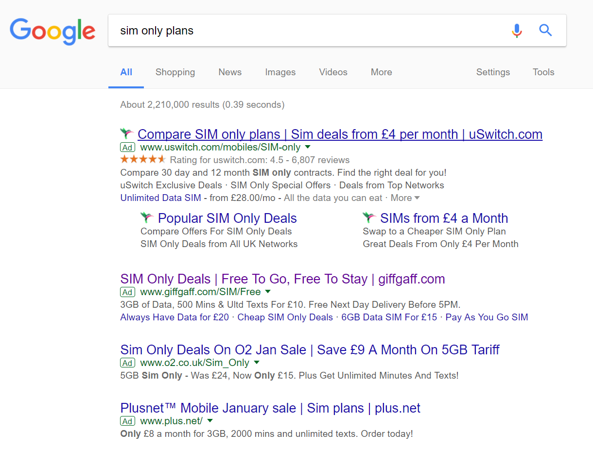
To view Giff Gaff’s PPC search advert, I had to type into Google search UK, ‘sim only plans’:
Looking at the advert itself, it has some good points associated to it:
- The title starts by addressing exactly what the web user searched for, increasing the contextuality from the perspective of the web user.
- The end of the title contains the URL to Giff Gaff, helping to promote direct traffic.
- The power word ‘Free’ is used throughout the advert, both in the title and description of the advert. This is a good implementation of power word since people always like anything relating to free.
- The description and site link extension outlines the plans that Giff Gaff offer. The fact these are included makes clear that there are proud of the cost of their plans, which is made clear from looking at the prices of other competitors.
After clicking on the above advert, I came to the following landing page:
- The background image is colorful yet minimalist, keeping the attention to the content on the page whilst looking ‘fun’ and ‘tropical’.
- The largest text on the page is a call to action ‘Order your free SIM to get started’. From being the largest font, the web user will likely read this first, increasing the likelihood of the web user fulfilling such a request.
- Below the call to action, Giff Gaff use the rule of three to entice web users into a plan that suits all. By displaying the three packages they offer with extra colours, it makes clear how simple the network are, as well as the transparency of packages Giff Gaff offer.
- The conversion on this page is a lead capture to order a SIM. This is made clear through the form to fill in, which is half displayed above the fold so the web user knows how to get a SIM if they should so want one.


