The last PPC campaign I analysed in the ‘Analyse A Real PPC Campaign’ series was from Bridgestone, who had a good search advert (except the typo) and a good landing page too. However, the paid search results was dominated by BlackCircles.com shopping results, which would naturally push people to clicking on them, especially since BlackCircles is targeting price sensitive customers through showing the prices for tyres.
With there being many clothing stores, both online and offline, it would be interesting to analyse a clothing store from searching for their own brand name. With this, here is an analysis of a PPC campaign from PULL&BEAR.
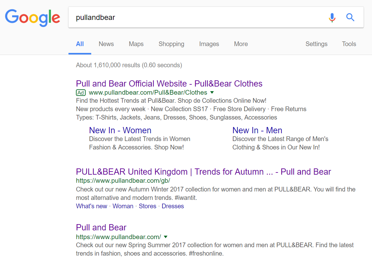
To view PULL&BEAR’s PPC search advert, I had to type into Google search UK, ‘pullandbear’:
What this PPC search advert is ultimately trying to do is specify further the type of web user that is wanting to shop at PULL&BEAR. Already, PULL&BEAR know that, from searching for the brand name, the web user wants to shop specifically at PULL&BEAR. However, since the clothing is very different for men and women, PULL&BEAR have adopted a PPC search advert, with the use of the site links extension, to narrow down each gender to view clothing for their respective gender. This is something that is not clearly possible with PULL&BEAR’s organic search results, hence the use of PPC.
After clicking on the above advert, I came to the following landing page:
The way they have done this is visually pleasing. There is an emphasis on the woman and man in the picture since PULL&BEAR wants the web user to click on either one to move onto a page where conversions can take place. This is helped from an overly simplistic navigation menu to not attract the attention away from the main area of the page. As well as this, the inclusion of live chat, even though is not a necessity for a click through landing page, is a great addition to illustrate the high customer service PULL&BEAR have for helping and pleasing customers.
Interestingly enough, this is the same as the homepage of PULL&BEAR. Therefore, it homes in on just how important the site link extensions are to this PPC campaign: to enable the web user to reach their gender clothing page a click quicker than going the traditional route through the homepage first, making life for the web user easier will usually result in a higher conversion rate.


