The last PPC campaign I analysed in the ‘Analyse A Real PPC Campaign’ series was from Saga, who had a relatively simple PPC search advert, which would not have worked to their advantage. However, they had a saving grace in the form of a great landing page, which would have converted well the traffic that clicked onto the search advert. With winter around the corner (or more like ‘Winter is coming…’), it is around that time of year that many motorists will start looking to equip their cars with winter tyres, to help improve the traction of their cars during the wet and icy season. With this, here is an analysis of a PPC campaign from Bridgestone.
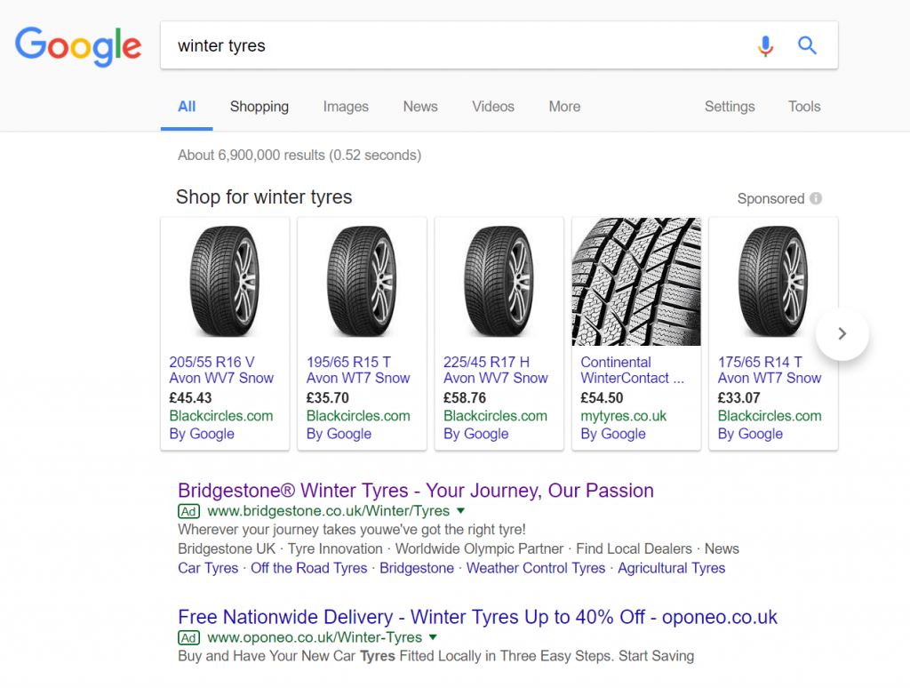
To view Bridgestone’s PPC search advert, I had to type into Google search UK, ‘winter tyres’:
Looking at the advert itself, it is a relatively good search advert with a title that includes the brand name, slogan and search terms, site link extensions that are all relevant to the web user as well as a description with lots of information. The only two criticisms of this advert are that:
- There is a typo in the first line of the description ‘youwe’ve’
- There is no call to action in any part of the advert
After clicking on the above advert, I came to the following landing page:
- The central area of the landing page is taken up with a detailed image of a car on a winter road, with the caption ‘Outstanding control in all winter conditions’ – this would evoke a sense of confidence with the web user that Bridgestone tyres are safe tyres to use during the winter season.
- The navigation menu in the top right is extremely simply, with no hover action to expand. This keeps the attention of the web user to the main conversion for this landing page: to get a click onto the ‘Find a store’ button, highlighted in red to make it more visible to the web user upon first landing onto the page.
- Upon clicking onto the ‘Find a store’, a lead capture box appears to fill in the postcode to find the nearest store to the postcode. From this, Bridgestone highlights the nearest stores you can buy Bridgestone tyres, helping to bridge the gap between using PPC and online advertising with buying their products in store.


