The changes that Google make to their pay per click advertising platform tend to correlate towards improving the user experience when using PPC as well as improving the click through rate (CTR) of adverts too. The latest innovation from the tech giants comes in how they display enhanced sitelinks in PPC as an ad extension for a search advert. With this, here is the change as we see it, what we can expect to happen and an analysis of the new format for the enhanced sitelinks.
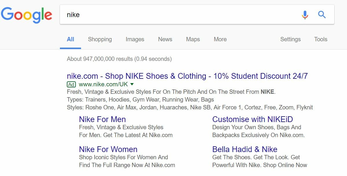
The enhanced sitelinks in PPC have had a tabular structure, where the links are displayed in a tabular 2 by 2, with a brief description underneath each one. An example of this comes with Nike’s search advert:
What can we expect to happen?
When Google releases something new in AdWords, typically what happens is that there is very localised testing, which could depend on what is being searched and where. For example, after an hour of searching using different keywords and on different devices, it appears that the new structure is not being tested in the UK as of yet. On the other hand, it appears the likes of Denmark are able to see the new structure.
What this means is that Google are only doing extremely small A/B testing, for their standards, to get an idea as to how the new structure affects factors such as CPC, CTR and quality score.
If the change does not improve key stats in PPC, you can expect this new structure for enhanced sitelinks to disappear gradually. However, if the new structure does improve the user experience and, overall, make Google more money, then we should start to see this change become implemented into more and more countries as Google expand their A/B testing of the new innovation.
New Enhanced Sitelinks: Analysis
The first impressions of this new structure for enhanced sitelinks is not the best. However, Google will be the only ones that know whether it will be better or worst than the predecessor.
The problem that potentially comes with this new structure is the fact that it takes up even more room than the previous, even with the reduced small font. From this, those that are ranked second, third and fourth are more likely to be pushed down the results page and potentially below the fold of the webpage. For advertisers, this is not good news at all. For this reason, you would expect to see the CPC increase systematically for all markets in order to get the top spot so that this does not happen.
In terms of the looks, it does come across well and will promote a better CTR. However, the question that Google will be conducting A/B testing to determine the answer to is ‘at what cost, if any’?


