One of the recent PPC campaigns I analysed in the ‘Analyse A Real PPC Campaign’ series was from Expedia, who had a good example of a title-heavy search advert with a landing page that had the objective of gaining a lead capture, so that it was possible for Expedia to show the correct ‘tailor-picked’ flights for the web user, from the information they entered onto the landing page.
Pensions are something that everyone has to think about and create so that they can be financially stable when entering and in retirement. For this reason, the pension sector is a huge market to profit from for businesses. With this, here is an analysis of a PPC campaign from QuoteSearch.
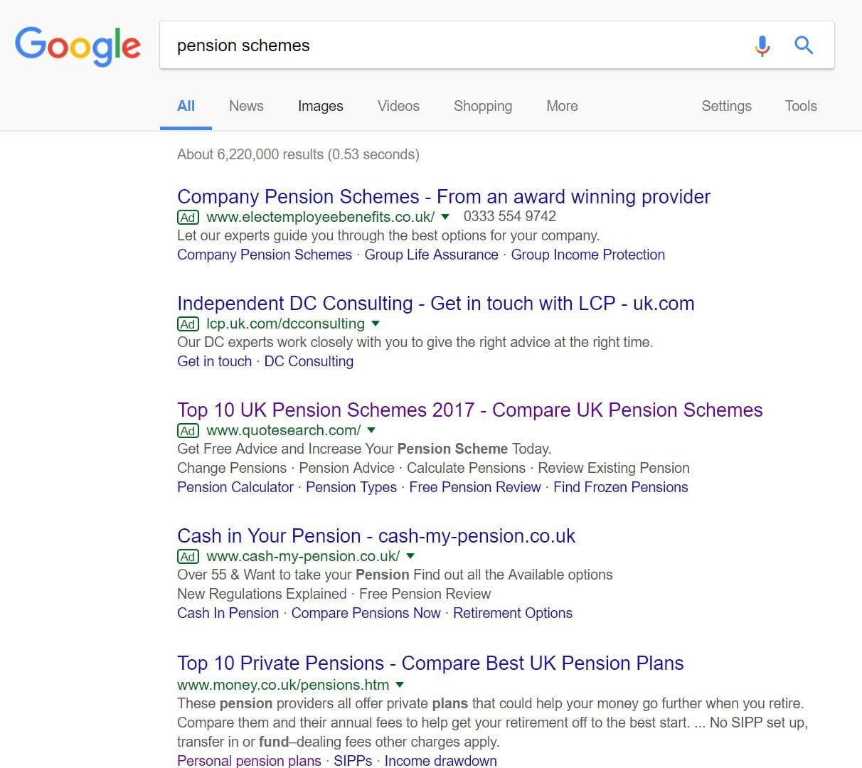
To view QuoteSearch’s PPC search advert, I had to type into Google search UK, ‘pension schemes’:
Looking at the advert itself, it is extremely similar to the money.co.uk organic search result, concurring with the idea that PPC campaign was produced to compete with and take traffic away from money.co.uk. The site link extension has been used to allow web users to look at different areas of QuoteSearch’s website that relates to pensions, which will help to increase the CTR of the advert on the whole – it appears that once the web user goes onto the landing page/website of QuoteSearch, they are likely to look at multiple web pages relating to pensions.
After clicking on the above advert I came to the following landing page:
- There are no links above the fold for the web user to click onto.
- The buttons that can be clicked in the bottom left corner of the page has content that is cut off by the fold of the web page.
Due to these two above points, the web user is seriously inclined to scroll down, for which they will see contains a lead capture involving details about a pension review.
Strangely, this landing page is not a comparison page, as we would have expected, of pension schemes. So, in this sense, it is bad that QuoteSearch has not followed on exactly from their search advert. Saying this, the design of the landing page would not turn people away, with web users likely heading to provide QuoteSearch a lead capture for a pension review.


