The last PPC campaign that was analysed in the ‘Analyse A Real PPC Campaign’ was from CarFinance247, who had a good search advert (with some areas of improvement) and an extremely effective landing page, which had many features adding to enticing the web user into a lead capture. With the Bahrain Formula 1 Grand Prix just concluding and Sebastian Vettel crossing the finish line first, it would be interesting to see a PPC campaign for an industry which is thriving in money, both from the fans and sponsors. For this reason, here is an analysis of a PPC campaign from Formula 1.
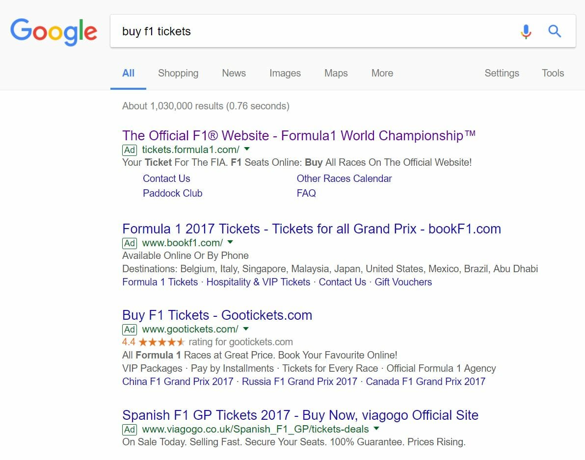
To view Formula 1’s PPC search advert, I had to type into Google search UK, ‘buy f1 tickets’:
Looking at the advert itself, the whole advert revolves around one effective word which is used as a USP to attract the web user into clicking on Formula 1’s PPC search advert and not others: ‘official’. From mentioning the word ‘official’ both in the title and description adds to the brand quality that is recognised with Formula 1. Formula 1 has also been clever here to include both copyright and trademark stamps in the title – this concurs with the brand quality since it instantly makes web users see that this is the official Formula 1 advert (as other adverts do not have such copyright or trademark symbols in them for obvious reasons). The advert also finishes with a call to action in the description, which will always help improve the CTR of the advert.
After clicking on the above advert, I came to the following landing page:
- There is nothing really going on with it. By this:
- There are no obvious links to click on above the fold.
- There is no information for the web user to fill in.
- There is no information about buying Formula 1 tickets.
- The navigation menu, although relates nicely to the sport of Formula 1, does not relate at all to buying tickets to view Formula 1.
- There is no incentive to view below the fold, since above the fold lacks little content to interact with.
As it is, below the fold are options to view tickets to different Grand Prixs. However, to get to the ‘click through’ section of this click through landing page is not, at first, intuitive at all, and lacks motivation and enticement from viewing the above the fold contents first. For this reason, this has to be one of the most ineffective landing pages that has been analysed in this series, unfortunately.


