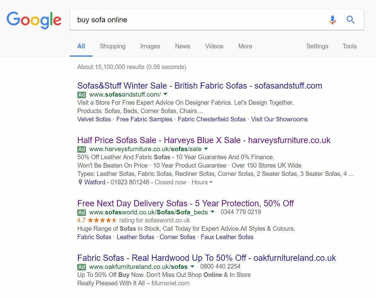
Google continually test their paid search results section to their search engine to better improve the experience for both advertisers and web users. Back in June 2016, Google changed the look of the ‘Ad’ sign (to signify paid search results) from having a yellow background to green. This certainly improved the looks of adverts on search results and reduced the number of colours on Google search results by one (since green was already present for the URLs of search results). Yet again, Google has changed the ‘Ad’ sign. However, instead of changing the colour, the ‘Ad’ sign has changed the background from green to white so that there is now only a green border surrounding the green ‘Ad’ text.
Evidently, this change is a recent one since my last article, which was part of the ‘Analyse A Real PPC Campaign’ series, saw a PPC campaign from Harveys get analysed. See the below screenshot taken of their advert:
The green ‘Ad’ sign is displayed for the paid search results, which is what we were use to since June 2016. However, from viewing adverts on Google today, you will see the difference for yourself:
On the whole, this looks to be a good move by Google. There seems to be a move towards minimalism with Google, for which they achieve by removing more colour away from their search results. This also means that the adverts will appear closer to organic results, helping to make them blend in better with the organic results. For advertisers of PPC and Google AdWords, they should be very pleased with this as it is likely the whole industry should see a slight increase in CTR to their campaign’s adverts.
A common problem associated to PPC advertising is when web users block adverts out from knowing what they look like. For this reason, to some extent, PPC has to keep constantly adapting itself, refresh itself if you so will, to remove this ‘block’ web users have over engaging with advertising content. Although this is not the biggest change Google has ever made, it is still nevertheless a change that will refresh the look of adverts, helping to lift the ‘block’ web users have over online advertising.
Ultimately, I get the impression that Google have made such a change to blur the line between adverts and organic search results further, which should improve the performance of PPC adverts (and make Google more money)! The ‘Ad’ sign is not as noticeable as before due to sharing the same colour background as the search results page. By this, it was easier to distinguish an advert from a quick glance due to the bold green background of the ‘Ad’ sign. Now that this has been removed, the ‘Ad’ sign blurrs much more easily into the URL which, at a glance, makes it harder to distinguish between what is an advert and what is not.


