The last PPC campaign I analysed in the ‘Analyse A Real PPC Campaign’ series came from GoDaddy, the giant in hosting and domains. What we discovered with their PPC campaign was that there was definately some major flaws with it, most noticeably with the landing page. The design was lacking a touch of creativity and the plain background didn’t suit it unlike it did when compared against the homepage.
In a world where it seems as if everyone is online, the one industry that can be relied on for consistant sales is the laptop industry – do you really know anyone who does not have a laptop? With this in mind, here is an analysis of a PPC campaign by PC World.
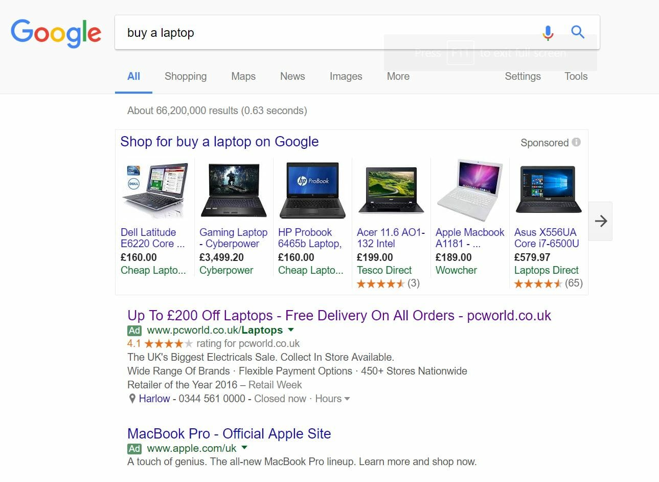
To view PC World’s PPC search advert, I had to type into Google search UK, ‘buy a laptop’:
Looking at the advert itself, I really like the way PC World have structured it as well as the content they have put into the advert. £200 off a laptop will make, near enough, anyone, interested into clicking onto the advert – it was a good idea to stick this information in the title, along with the domain name to entice direct traffic too.
As well as this, the inclusion of a nearby store as well as opening times will give the web user the flexibility to either browse online or find a nearby store to see the laptops in person. For many wanting to buy laptops, it is a nice touch to try out laptops in person before purchasing.
After clicking on the above advert, I came to the following landing page:
- The whole landing page is completely filled with links, hover navigation menus and more so that the web user can find a specific type of laptop they want or browse other areas of PC World’s website. I can tell the bounce rate is going to be extremely low for this landing page.
- Discount codes always go down a treat online, as they invoke a sense of panic buying into the web user from them knowing the discount code is only applicable for a selected time. Having the discount in red emphasises this, helping to induce buying a laptop sooner rather than later to get the best deal possible.
- The laptops that are shown on this landing page, when scrolled down, highlight their main specs and prices, in a clear and easy to read fashion. This makes it easy for web users to browse through tens of laptops to find the right laptop for their needs.


