The last PPC campaign I analysed in the ‘Analyse A Real PPC Campaign’ series was from CarWow, who had surprinsgly surpassed OEM’s PPC campaigns to reach the top spot for paid search results for the search phrase, ‘buy a new car’. As well as this, the landing page was a brilliant example of how one should be designed, with many points advertisers could take note of for thier own campaigns.
With hundreds, if not thousands of websites being created everyday, a crucial aspect to starting a new website is purchasing the right domain, when available. With this in mind, here is an analysis of a PPC campaign from GoDaddy.
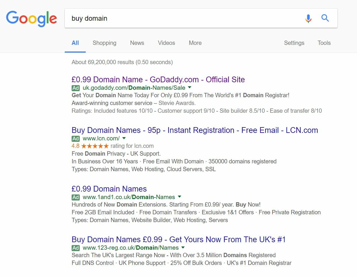
To view GoDaddy’s PPC search advert, I had to type into Google search UK, ‘buy a new car’:
Looking at the advert, I think the targeting and ‘way to get the web user to click onto the advert’ could be improved. This is because:
- They have gone for the price sensitive customers by mentioning the cost to buy a domain. But, if the price sensitive customer was going to pick an advert, he or she would then surely pick the cheapest option, which is LCN’s advert.
- GoDaddy have great brand awareness for website creation, hosting and buying domains since they promote their brand using other forms of advertising such as radio and TV advertising. Therefore, I feel GoDaddy could get a better CTR if they led the way by differentiating themselves from the other PPC adverts not through cost but through the fact that they are GoDaddy. For example, it might have benefitted the advert more if they included ‘From The World’s #1 Domain Registrar!’ in the title rather than the description.
After clicking on the above advert, I came to the following landing page:
- Yes, there are bullet points to say why the web user should go with GoDaddy. However, the centre of the landing page seems a bit too simple and has the feeling that it is was quickly designed, almost like by an amateur.
- But, the number one problem with this is the fact that there are no images on the landing page. Images have the potential to speak a thousand words. If they had included an image to the right of the content or had it as the background to the central content, I feel the conversion rate for this landing page would increase. Interestingly enough, this is what GoDaddy does for this homepage:


