The last PPC campaign I analysed in the ‘Analyse A Real PPC Campaign’ series came from Elfster, who was targeting users wanting to buy a Secret Santa gift. On the whole, both the search advert and landing page were good which overall gave the impression of a very well designed PPC campaign. With Christmas just a few days away, now is the time to see what type of PPC campaigns appear for when the web user searches to buy a gift. Therefore, without further ado, here is an analysis of a PPC campaign from PrezzyBox.
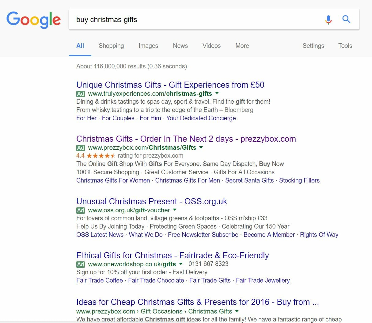
To view PrezzyBox’s PPC search advert, I had to type into Google search UK, ‘buy christmas gifts’:
It would have been better if they were ranked #1 of paid search results. But, the fact they have the ratings extension gives a bit of colour to their advert, which does set it apart from the rest quite nicely.
After clicking on the above advert, I came to the following landing page:
The first 5 seconds of landing onto any landing page are crucial since web users are prejudice. However, upon landing onto this page, I immediately want to stay simply because there is a nice compliment of Christmas theming as well as images and content to click onto, relating to what I searched for on Google. Below are the key pros to this landing page:
- It is clear this is a Christmas landing page, from the logo and snowflakes behind images – this will make web users stay on the page since it related to what they searched for.
- PrezzyBox addresses the ‘cut off’ time for delivery before Christmas which would have been the main concern for those buying gifts for Christmas so soon to the 25th (I viewed this landing page on the 20th). Therefore, this will give confidence to the web user that they can browse PrezzyBox knowing they will get their gifts, if bought from the site, before Christmas.
- PrezzyBox addresses everyone with this landing page, with gifts for him, her, kids and general stocking fillers. Therefore, no matter what type of gift you are searching for, you can find the right one for the person you are shopping for.


