The last PPC campaign I analysed in the ‘Analyse A Real PPC Campaign’ series was from Currys, who had a good search advert but a not-very-well optimised landing page which had many areas of improvements – this was because Currys were too lazy to make a separate landing page and used an existing product page from their website which is definitely not optimised for PPC. With the online casino being a fierce market to compete in, I thought it would be the perfect area to look into a PPC campaign for this article. Therefore, without further ado, here an analysis of a PPC campaign by Vegas Paradise.
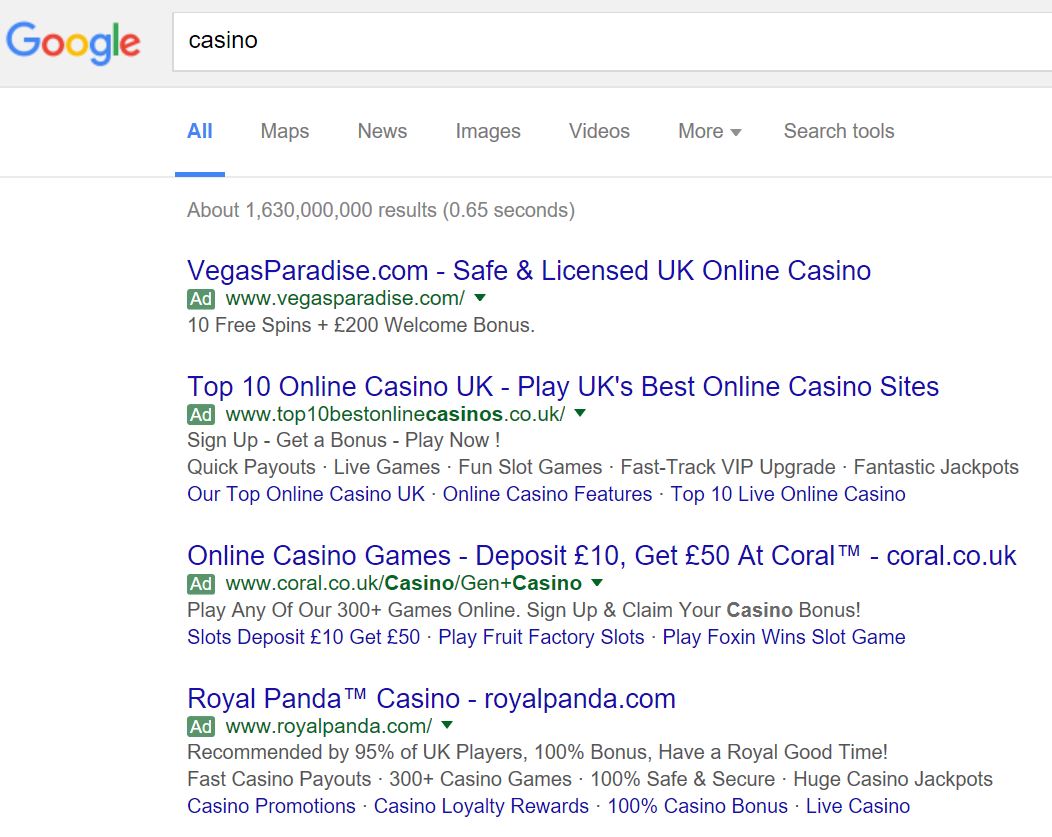
To view Vegas Paradise’s PPC search advert, I had to type into Google search UK, ‘casino’:
After clicking on the above advert, I came to the following landing page:
- The centre area of the landing page is taken up by a large skyscraper building and large text making it clear there is a 100% welcome bonus up to £200. This is good since skyscrapers can be linked to casino areas such as Las Vegas and by making the ‘100%’ text the largest on the landing page will help to get it noticed first by the web user.
- The styling of the whole landing page gives the impression of wealth: something which casinos always try to do to enable the customer to feel ‘special’ when using the casino. This is achieved on this landing page with the central image, gold in the bottom right and left, the gold lion logo of Vegas Paradise and the general dark exclusive theme of the page.
My only slight criticism with the PPC campaign is that the link between the search advert and landing page is not 100%. By this, the description of the search advert claims you can have a bonus up to £200 and 10 free spins. However, on the landing page, it only states a £200 bonus and not 10 free spins with it. This can cause a little confusion to the web user which might turn them away, since it is the offer of a bonus and free spins which will entice web users the most into signing up with Vegas Paradise.


