The last PPC campaign I analysed in the ‘Analyse A Real PPC Campaign’ was from 1&1, who had a ‘mediocre’ search advert with a few questionable areas but a brilliant landing page. However, even with the brilliant landing page, the whole campaign would have suffered due to the average search advert – I like to think of a PPC campaign as a domino effect – if any one domino struggles to fall, it will cause consequences for every domino after that.
With many technological manufacturers releasing new TVs around this time of year, I thought it would be a good idea to look at a campaign that is promoting new TVs. However, I did not find an OEM manufacturer of TV with a PPC campaign! Therefore, without further ado, here is an analysis of a PPC campaign from Currys.
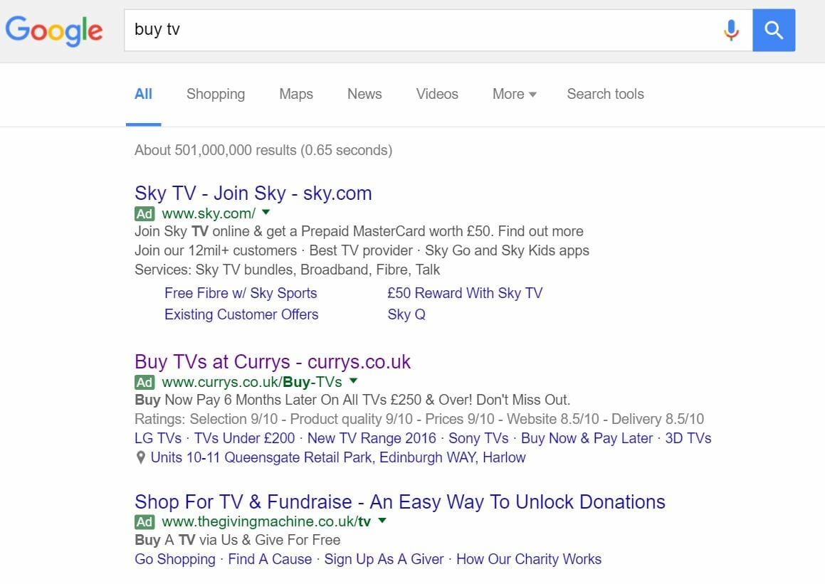
To view Currys’ PPC search advert, I had to type into Google search UK, ‘buy tv’:
Moving onto the description, it is clear Currys’ are further targeting price sensitive customers by offering different ways to pay for their TVs. As well as this, I like their use of a call to action ‘Don’t miss out!’ to inject a level of urgency into getting the web user to buy a TV and gain Currys a conversion.
After clicking onto the above search advert, I came to the following landing page:
- It is far too cluttered – Being a PPC campaign targeting selling TVs, there is far too much going on not involving TVs.
- However, from being so cluttered will force web users to scroll below the fold to find relevant information to what they searched for, which will help since it is below the fold where TVs and their prices first appear. What would have helped, though, is if Currys decided to make it obvious that the web user had to scroll below the fold to view TVs.
- The colour scheme, well, there really isn’t one. Currys could have used a colour scheme since colours do make a big difference to landing page performance – take Nivea’s PPC landing page as an example.
Although Currys are directing traffic to the part of their website that TVs are listed on, this doesn’t necessarily mean it is the best page. There are more things that could be optimised on this page than not which makes the choice of landing page from Currys lazy at best.


