The last PPC campaign I analysed in the ‘Analyse A Real PPC Campaign’ series was from Center Parcs, who had as what can only be described as a having a good search advert but a landing page which had areas to improve, such as the lead capture section of it. Summer is coming which means more sunny weather and the weekly/2 weekly period for those with gardens to mow their grass. Therefore, without further ado, here is a PPC campaign analysis for wanting to buy a new lawnmower.
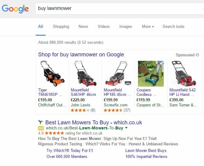
The PPC campaign I am going to be analysing in this article is going to be the only advert that appears for the search phrase ‘buy lawnmower’ on Google search UK: Which?
This does beg the question whether Which? has done something wrong? It is actually quite on the contrary. The Sponsored results are for buying actual lawnmowers. Which? has a search advert to promote their guide to buying the best lawnmower – since I, the web user, searched for something that was quite vague, it is clear I only want to buy a lawnmower and have not chosen what lawnmower to buy. For this reason, I think the advert Which? have created is perfect to gain clicks for people with this exact need. The ratings extension makes clear Which? have a great reputation and the site links extension increase the area the advert takes up on search engine results which will encourage web users to look at it (as the whole advert is generally larger). As well as this, the site links Which? have chosen to use compliments the advert by continuing where the description left off.
After clicking on the above advert, I came to the following landing page:
- It puts the web user first – the web user wanted to buy a lawnmower. So instead of filling the landing page with reasons to sign up with Which? etc. Which? have simply addressed what the web user wants: information on buying the best lawnmower.
- The page naturally induces the web user to scroll down to read the full information about buying the best lawnmower by displaying a summary of the content below the fold.
- The navigation menu is a dream to use, displaying multiple options upon clicking on any of the links.
- The landing page is very clean – this will do Which? wonders in achieving a low bounce/exit rate.
Ultimately, Which? wants the web user to sign up with them. However, they have put the needs of the web user first and offered them an insight to the type of reviews the web user can expect if they signed up with them. Even if the web user chooses not to sign up, one thing that Which? can be sure will happen is that the web user leaves the landing page with the utmost rating of Which? in general.


