The last PPC campaign I analysed in the ‘Analyse A Real PPC Campaign’ series was from Samsung who were looking to use PPC to promote their new flagship smartphone, the Galaxy S7. However, by bidding for this own brand name they were fending off competition from other companies that were selling the S7, so web users went directly to Samsung (who most likely gained a larger profit margin per phone sold as compared to the web user buying the phone from one of the PPC competitors). With driverless cars being in the news, what seems like, every week, I thought I would see if there are any adverts at all for this emerging market. Therefore, without further ado, here is a campaign analysis from Nesta.
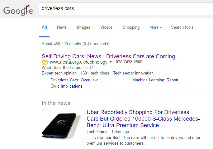
To view Nesta’s PPC search advert, I had to type into Google search UK, ‘driverless cars’:
- The title is spot on – it addresses what the web user typed, what the landing page is likely to be (a news blog about driverless cars) and is keyword rich to what the web user searched.
- The description is a masterstroke. By keeping it simple and asking the web user a question will make the web user want to know the answer – to get the answer, he or she will have to click onto the advert.
- To give the web user some variation of some articles that can land onto, the site link extension is used.
Judging from the fact that Nesta are trying to advertise themselves as the ‘new’ news blog on driverless cars for the web user, in whole, I think the advert does a good job at achieving this.
After clicking on the above advert, I came to the following landing page:
- This is not a dedicated landing page – The landing page Nesta chose to use is simply the search results of this site from searching ‘driverless cars’…really? There are so many reasons not to do this with the main being, well, just look at it!
- The main center area of the landing page is wasted with the search results form. It would have been much more effective if they had made a dedicated landing page which removed this area with something such as a lead capture to get the web user to sign up to an email subscription on the topic of self driving cars.
- It’s bland and there is next to nothing to click on – First thoughts matter online. After 5 seconds, I want to exit the page because it is bland in color and looks boring. As well as this, although there is a menu bar at the top, but having one button as the whole menu is not really good enough to give the web user a quick idea of the categories on the website. To top this off, the menu does not contain any useful links involving technology, news or driverless cars! This landing page has let the whole campaign down significantly.


