The last PPC campaign analysed in the ‘Analyse A Real PPC Campaign’ series was from Home Made By You, who had a different approach to the typical campaign. Instead of promoting a product or service, it seemed the campaign had the objective to spread the ‘Home Made By You’ brand awareness and share information with the web user that was useful: in the hope that they will come back to the website directly in the future when in a similar situation. For this article, with Samsung recently releasing their new flagship phone for 2016, I thought I would analyse the official campaign by Samsung for the Galaxy S7.
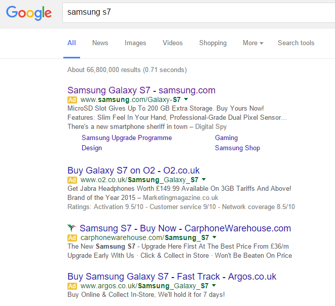
To view Samsung’s PPC search advert, I had to type into Google search UK, ‘Samsung S7’:
Straight away, we can see the change that has been implemented onto Google search results: instead of there being three adverts above organic search results, there are now 4, increasing the competition amongst campaigns. Even with this change, Samsung are ranking #1 for their own brand name which is a must – in essence, all the other campaigns are trying to steal traffic away from Samsung to make a profit from their phone.
In terms of the advert, it is textbook. The title addresses the phone and domain name of Samsung to promote direct traffic. The description highlights the main new features of the S7 (being the microSD slot and the new camera) and, to top it off, Samsung went for the sitelink extensions to increase the chances of a click onto one of the links in their advert. As well as this, the sitelink extensions also increases the real estate space the advert takes up, giving the impression of a larger dominant advert for such a crucial keyword (which would be something Samsung would be wanting to achieve).
After clicking on the above advert, I came to the following landing page:
- We cannot see the full phone – This encourages the web user to scroll down to see the rest of it, which then opens the web user up to different tabs to find out more information about the S7 such as features, tech specs and so on. Therefore, Samsung does not need an arrow or anything to ask the web user to scroll down – they will self consciously scroll down just to see the phone in full.
- The slogan is brilliant – By only partially showing the phone, the web user’s imagination will be at work from reading the slogan, with the aim that what the web user was thinking was what the S7 has (such as a microSD slot, great camera, great battery, great design and so on).
- Feedback to improve – How do we know if this is an optimized landing page? If you look to the right, there is a tab that states ‘Feedback’. This opens up a window where the web user can give quantifiable feedback on how good the landing page is – great for Samsung as this will help them adapt the landing page to gain the best positive feedback back from it possible.


