The last PPC campaign I analysed in the ‘Analyse A Real PPC Campaign’ series was by Sky, who had what could only be described as an ‘okay’ advert – the interesting area came with the landing page which was a hybrid between a product/service page and a click through page. With the weather getting colder (depending on where you live), it is that time of year when the frost starts to come (and even snow in some areas). Therefore, let’s analyse a campaign that is targeting web users who want to buy their cars winter tyres. For this reason, the PPC campaign I am going to be analysing is from Blackcircles.com.
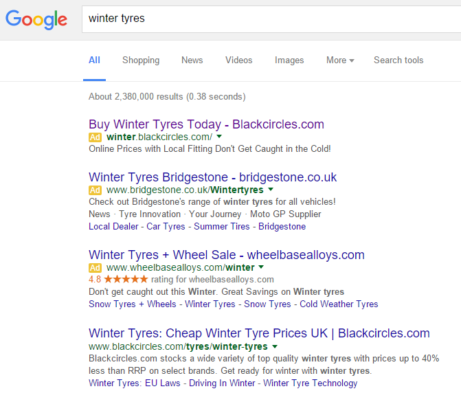
To view Blackcircles.com’s PPC search advert, I had to type into Google search UK, ‘winter tyres’:
- There are advertising campaigns above the #1 organic search result from Bridgestone and WheelBaseAlloys who will be, in essence, ‘stealing’ contextual traffic away from Blackcircles.com.
- In order for Blackcircles.com to stop this from happening, they need to make a PPC campaign for such a keyword and adopt a high CPC to get number one spot on paid results.
For this reason, it is a campaign that would have reacted to the competition – Blackcircles.com most likely did not want to spend out on winning this PPC bidding war. But, they have had to in order to stop traffic being lost to a competitor.
Looking at the advert itself, it is a great example of a search advert. The title addresses what the web user wants and includes a call to action and the URL to their website. The description provides more information and another call to action to entice the web user further into a click. My only criticism is that the description could have a ‘|’ in between the ‘Fitting’ and ‘Don’t’ since these are two phrases that should not be part of the same sentence (it’s only a small criticism of a great advert still).
After clicking on the above advert, I came to the following landing page:
- The brand name should now be encrusted into the web user with its clear logo design.
- The navigation menu helps the web user find what they want (since we did not specify if the winter tyres were for a car or bike).
- The main attraction of the page is the car in the snow image with text on top of it. As well as including information for price sensitive consumers to the right, Blackcircles.com also used the rule of three by including three bullet point reasons as to why people should use winter tyres, encouraging the web user to purchase winter tyres from Blackcircles.com.
- The blue area at the bottom of the landing page is genius as it clearly shows the landing page continues below the fold.
All in all, it is a great landing page that many advertisers should take note of how they have optimized it for their product Blackcircles.com are selling.


nick
January 15, 2016 at 11:27 am
Hi will. There is a paid awareness, acquisition and retention strategy behind the points that you raise here which I cannot go into in the public domain but a great piece and many thanks for your positive comments.
regards nick. marketing director. blackcircles.com