By Ross Kaplan-Winn
It is crucial that what you offer in your ad align with your landing page, something Digital Marketer calls “ad scent”. Not only do you get a slight boost in quality score, but conversion rates will greatly increase if the prospect doesn’t have to search around your site (or more likely bounce) to verify you can solve their problem.
We are going to look at different ads (mostly AdWords search ads) and their corresponding landing pages to see what they are doing right and wrong – and what you can do to avoid their mistakes.
Quick Note: I did not click on ads during my research. There are competitive intelligence tools and other ways to get to the landing page without charging the advertiser for a click.
Ad / Landing Page #1 – Drywall Repair
Great ad. It tells you what to do and what will happen before you even hit the landing page – priming the user for what to expect and how easy it will be. Somewhat unique “First, Second” ad text stands out as well. It could be worth testing different sitelinks that are more closely related to drywall repair.
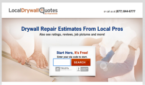
Landing page is great. The call to action (enter zip code) and the headline (drywall repair cost/estimate) match the ad – plus there is a phone number and a couple trust elements that help the prospect feel comfortable submitting their information. Even the background picture appears to be drywall related. Great job!
Ad / Landing Page #2 (and #3) – Airline Flight Search
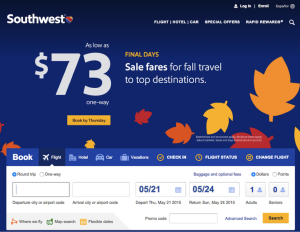
This ad was on Kayak during one of my recent flight searches. When I saw it, I knew Southwest didn’t fly to Naples, Italy so of course I had to see what the landing page was. Now I know that this was most likely the result of an automated/dynamic headline ad, but it is possible to exclude ads from showing on international airports if they don’t fly there. Side note: they do have flights to Naples, Florida.
Nothing about Denver or Naples (Italy or Florida). They do make it easy to search, but I would like to see the departure city (and date, but that might be harder to do) automatically filled with the city I had searched for on the previous page.
For comparison sake, I did a search on Google (“Denver to sSan Diego flights”) and Kayak for 2 cities they do fly to and the landing page looked the same – nothing about the cities I was searching for.
What is interesting is that their organic results (#2) leads to a page that highlights the flight I was looking for.
One of the top ad / landing page combinations from a competitor does exactly what I was asking:
This page is relevant to my search and pre-filled the cities, saving me several steps. Good work!
Ad / Landing Page #4 – Toyota Tacoma Review
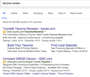
I got the idea for this one during the Broncos game. Toyota has been advertising their new Tacoma – featuring an off-road, get out and play theme. I wanted to see if their PPC ads matched their marketing campaign.
The ad seems to match with “The Trail Doesn’t Stand a Chance” line. Sitelinks are accurate and the 10/10 Ratings reinforce Toyota as a brand. But let’s take a look at the landing page:
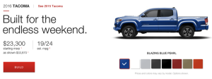
Headline matches the marketing theme. Even the header image (not pictured) matches the desert shots from the TV commercial. But remember I typed “Tacoma reviews” and there is nothing about reviews, awards, feedback, etc. until you scroll all the way to the bottom of the page.
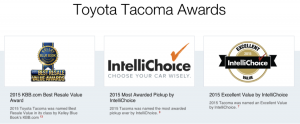
They have a link to Awards which is much more relevant to my search:
They also have edmunds.com consumer ratings on the awards page which is most likely what I would be looking for. This is the type of page I would like to see when I search for reviews, although the page doesn’t seem well designed. Toyota should add a call to action on this page leading back to the Build, Compare or Find Local Dealers sections. Most of their site does this nicely.
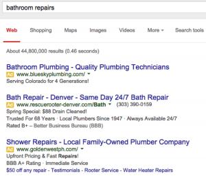
It’s also possible to be too specific. Take a look at this search for “bathroom repairs” with a result for “shower repair”.
It could be relevant but there is a good chance that a large percentage of searchers won’t be interested in only shower-related repairs. I understand this search is very generic and could be almost anything – remodeling, plumbing, sink, faucet, cabinets, etc. – but I would try to match the search term with the headline or highlight more than one service related to bathroom repairs you can do.
The new Structured snippet extension is a great way to highlight additional services you offer. The sitelinks could be more focused around bathroom related services as well.
Wrap-up and Recommendations
Offers and promotions change all the time, many times at the last minute, so it is important as a PPC manager to regularly communicate with the product teams and web design teams to avoid any disconnect or incongruences between your ads and your landing pages.
Check the search query reports regularly to find opportunities to create more relevant and specific ad groups – with the appropriate ads and landing pages to match.
Be sure to use to use the proper keyword match types (and negatives) so that the user’s search matches your keywords which align with your ad and landing page. I would avoid broad match unless you know what you are doing.
Do you have any other feedback on the ads or landing pages mentioned above? Or do you have any other sites we should critique? Let me know in the comments.
Author Bio:
Ross Kaplan-Winn runs an agency where he consults on digital marketing strategy and the best ways to grow a business online. He also teaches small businesses and entrepreneurs how to make AdWords work for their business at paidinsights.com. You can follow him @paidinsights.


