The last PPC campaign to have been analysed in the ‘Analyse A Real PPC Campaign’ series was from Debenhams, who had a campaign that was not as well targeted as I had hope – from searching for Christmas jumpers, Debenhams had a campaign looking more at jumpers in general.
Although I have already analysed a PPC campaign from John Lewis, I thought with the build up to Christmas growing, it is the perfect time to analyse one last Christmas PPC campaign for 2015. Therefore, without further ado, here is a PPC campaign analysis of a Christmas campaign by John Lewis.
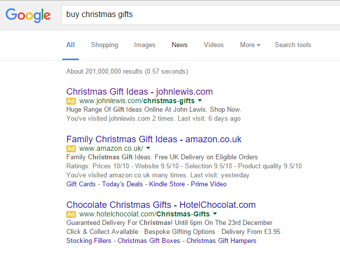
To view John Lewis’s PPC search advert, I had to type into Google search UK, ‘buy christmas gifts’:
Looking at the search advert, it is a great example of what a Christmas advert should look like. It addresses what the web user searched for in the title, makes clear in the description that John Lewis has a huge range of Christmas gifts (which the web user wants, since they did not search for anything in particular), has a call to action at the end of the description to entice the web user further and features John Lewis as a brand name three times so it encourages the web user to directly go to John Lewis if they chose to not click on the search advert in this case.
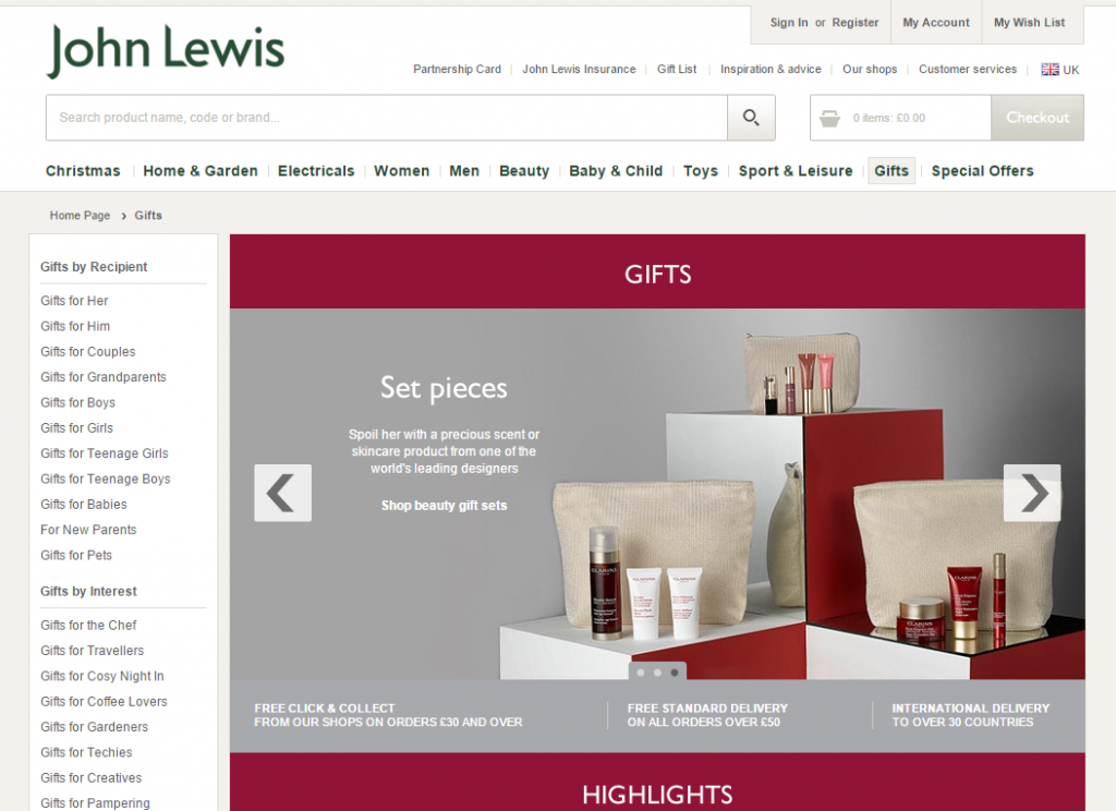
After clicking on the above advert, I came to the following landing page:
- The plus points – It has an extremely good navigation menu at the top and left which will allow the web user to find anything they want to. Looking at the landing page from this perspective, it is a click through page (especially if you see the ‘Gifts by Interest’ links in the left navigation menu).
- Onto the bad points, I am really disappointed with the slideshow John Lewis chose to put in the prime area of the landing page. It features only three images (which is quite low to show a whole range of gifts John Lewis has on offer) and the images only target a select market: set pieces for women, gift wrapping and food. John Lewis has an extensive range of technology on offer so I am quite shocked that they did not choose to include some sort of technological image in the slideshow and other areas too? This does bring the point forward that if you do choose to use slideshows on PPC landing pages, make sure it is completely and utterly representative of what you are wanting to sell/promote.


