The last PPC campaign I analysed in the ‘Analyse A Real PPC Campaign’ series featured Apple’s new variation of the tablet: the iPad Pro. Since this was a new product, it made sense to spread the brand awareness through PPC in the iPad Pro’s early stages of it’s life. As well as this, the vagueness of the iPad Pro’s advert made sense too as Apple wants web users to explore the tablet on their landing page. With it coming ever closer to Christmas, you will start to find all of the major smartphone manufacturers starting to release their flagship phones in preparation for the Christmas rush. For this reason, I will be analysing a PPC campaign by Microsoft showing off the Nokia Lumia series.
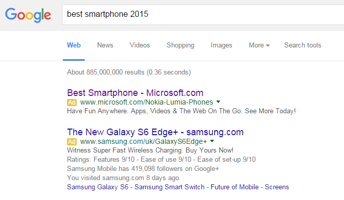
To view Microsoft’s PPC search advert, I had to type into Google search UK, ‘best smartphone 2015’:
It is a great idea to bid for such a keyword search phrase as by typing in ‘best smartphone 2015’ straight away implies that the web user does not know what the best smartphone is out there and is using the internet to find out. So, if you can guide this traffic to a landing page which makes Microsoft’s smartphone look the best, then there is a chance they will buy that as it fits their needs of seeming to be the best smartphone of 2015.
Looking at the advert, it is clever in associating the smartphone with Microsoft more than Nokia (maybe Nokia is not a good make any more when compared to the likes of Apple and Samsung)? The description of the advert is packed with features of the smartphone and has a call to action at the end which will serve to be effective in increasing the CTR of the advert that tiny bit more. It is also a clever tactic to not give away the name of the ‘Best Smartphone’ in the advert so that web users, if they want to find out specifically what the ‘Best Smartphone’ is, they must click on the advert.
After clicking on the above advert, I came to the following landing page:
Putting this aside, I also feel this landing page is just a bit bland. It is all too white which does not portray the devices being advertised on it. The devices have USPs of being colourful, customizable and bright. So, to illustrate these USPs, Microsoft could have made the landing page in a similar style?
Unfortunately, it just seems like Microsoft have not put much effort into this landing page and seem to have used a standard page on their website as their landing page for this campaign. No wonder Microsoft Windows Phones do not have much market share at the moment with campaigns like this!


