The last campaign to have been analysed in the ‘Analyse A Real PPC Campaign’ series came from O2 smartphones who had generally a well optimised search advert and PPC landing page. Now, being a technology fan and always trying to keep up with the news, I am sure that the chances are that you have heard the news about Apple’s keynote of new products services it has for offer for the rest of 2015 and 2016 – one of these new products is the Apple iPad Pro. With the iPad Pro at the very start of it’s product life cycle, it is important to the success of the super sized tablet to get as much publicity as possible: especially with the fact that Christmas is only a mere three months away. Here is an analysis of Apple’s PPC campaign for the new iPad Pro.
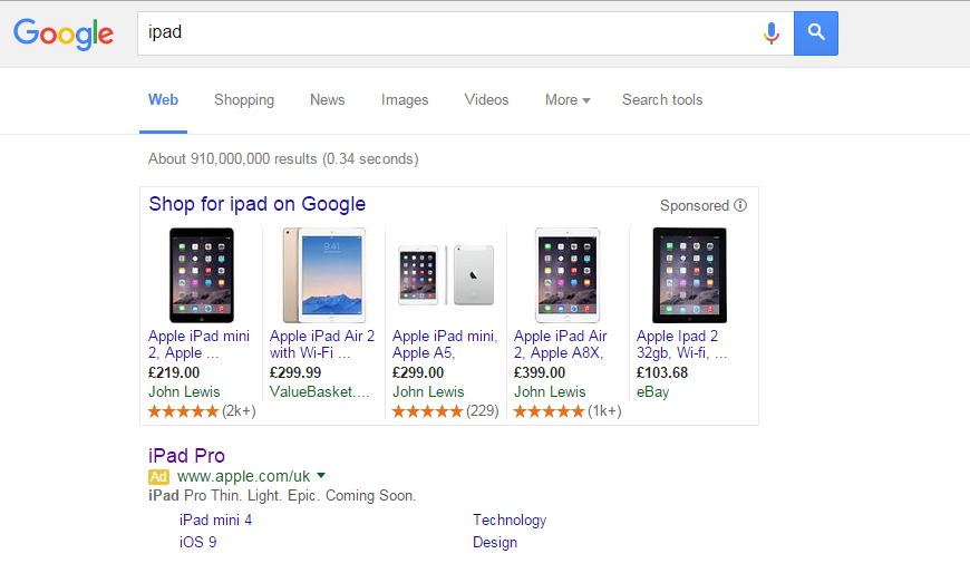
To view Apple’s search advert, I had to type into Google search UK, ‘ipad’:
Looking at the advert itself, it is the epitome of Apple and PPC search adverts – not much content, to the point an vague so it entices web users to click onto the advert to find out more information about the new product. There are a few potentially negative points about this advert though (which is a surprise to say the least)!
- Why did Apple mention that it is coming soon? Surely that could have been mentioned in the landing page as this will put people off clicking if they know they are only going to look at something they cannot have yet.
- The first sentence in the description feels like it needs a full stop after ‘Pro’ as it makes it sound like the name of the device is ‘iPad Pro Thin’. To conform with the rest of the advert, each description off the iPad Pro needs to be separated by full stops.
- Why has Apple included site links as an extension? This has given web users the possibility to look at the iPad mini 4: again, a cheaper alternative to the iPad Pro potentially. If Apple wanted to advertise this new product, they really need to make the whole advert about the product.
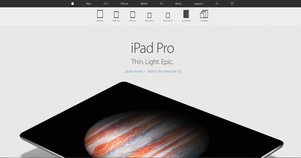
After clicking on the above advert, I came to the following landing page:
- The navigation menu is minimalistic and displays every area of Apple’s website for ease of browsing.
- The lack of content makes the image of the iPad Pro the centre attraction.
- What I love most about this landing page, though, is the fact that the iPad is not in full view – for the web user to see the iPad Pro in full view, they are going to have to scroll down which sets off the animation scrolling of the different features of the iPad Pro…genius.


