The last article to have been analysed in the ‘Analyse A Real PPC Campaign’ series was thetrainline, who had created a campaign for such a keyword phrase even though they appeared organically number one and had used their homepage as their landing page (with reasons behind why in the article to both). In this article, I thought I would look into the furniture market to see what types of PPC campaigns appeared for people that wanted to buy furniture online. Although it will cost a lot to post and package, there is still a large market to buy furniture online. In this article, I will be analysing a campaign from OfficeFurnitureOnline.
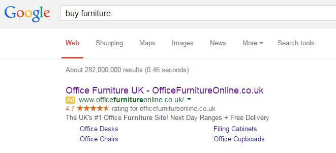
To view OfficeFurnitureOnline’s PPC search advert, I had to type into Google search UK, ‘buy furniture’:
Looking at the advert itself, it is a well optimised advert for the following reasons;
- It is packed with keywords to make clear to the web user that it is something that they were looking for online. This will help promote a healthy CTR.
- They have used two ad extensions being the rating extension and site link extension. The rating extension will give confidence to the web user while the site link extension is enabling the web user to view what they were trying to find a lot quicker and easier.
- Before seeing the advert, I did mention that delivery would be costly. But, it appears that OfficeFurnitureOnline have a USP (unique selling point) that they include free delivery with their orders. So, as well as seeming like the #1 place to go to and the high praise they have from ratings, OfficeFurnitureOnline are also looking at the cost-effective market too – although the advert is specific, it enabled a wide range of secondary markets with the furniture market to click onto it.
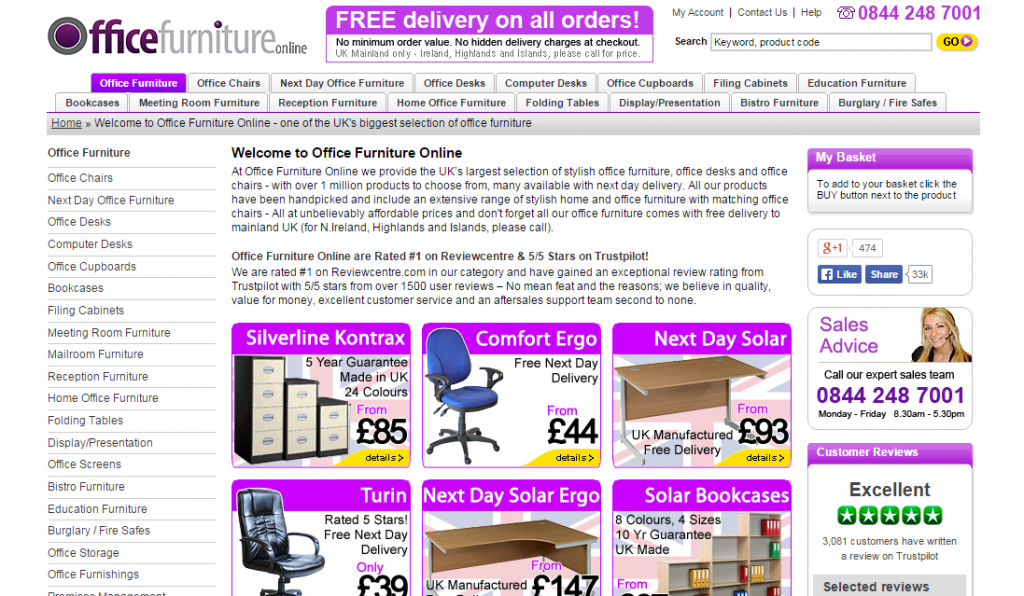
After clicking on the above advert, I came to the following landing page:
- OfficeFurnitureOnline have been lazy and have used their homepage as the landing page. This is fine if the homepage is good enough to be used as the landing page. However, with OfficeFurnitureOnline, it is not.
- The main centre attraction of the page is filled with small text – this is a big no! PPC traffic do not want to read small text! This will significantly affect their exit and bounce rate.
- The links are all over the place. A general rule of thumb is that you should keep the way a link appears the same on a landing page so it is simpler to interact with the landing page. The sidebar has links different to the navigation menu which are different to any other link on the page!
- There is just too much content and text making the whole page quite overwhelming.
- I honestly do not know what OfficeFurnitureOnline are doing with their logo: did they run out of room for the ‘online’?
If you want an idea of what not to do for a landing page, OfficeFurnitureOnline have given us a good example.


