The last article which was analysed in the ‘Analyse A Real PPC Campaign’ series was Disney, who generally had a good PPC campaign with the exception of a few bad points on the landing page. I stress it time and time again that the landing page is one of, if not the, most important aspect of a campaign. So do make sure it is as optimised as possible. For example, Disney on their landing page wanted the web user to scroll down but there was nothing enticing the web user to do that. As well as this, the link on the image is very vague to find so if it was a click through page, it was a poor one at that too. Anyway, in this article, I will be looking at the music industry to see a PPC campaign conducted by Tunecore.
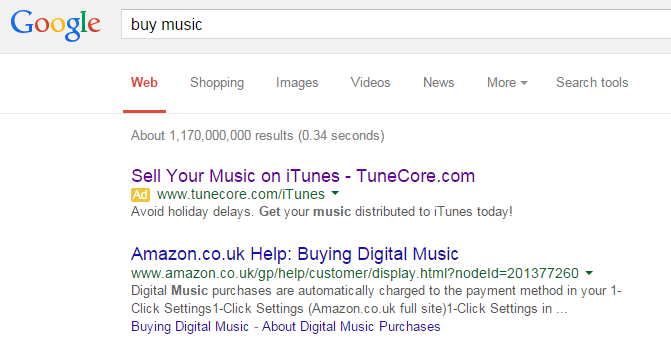
To view Tunecore’s PPC search advert, I had to type into Google search UK, ‘buy music’:
The advert is a great example of poor keyword targeting. Tunecore are focusing their advert on music producers that want to distribute their music through iTunes. Whereas, my search phrase ‘buy music’ suggested exactly what I searched for, to buy music! Therefore, we already know that if a web user clicks onto this landing page, the chances are that they will not convert anything because they did not want to distribute their music on iTunes but simply buy music! For that matter, how does Tunecore even know the traffic who search ‘buy music’ even have music to distribute? It is a great example of poor keyword targeting which will do nothing but cost Tunecore time and money.
After clicking on the above advert, I came to the following landing page:
- This is a click through landing page made clearly by the bright orange button.
- The navigation menu is nice and minimalistic. The sign up button for Facebook also makes it easy to signup and use Tunecore’s services.
- The ‘Top 6 Things…’ title will make the web user want to scroll down if they are interested in iTunes and getting their music onto iTunes. It also makes Tunecore seem like they know what they are doing.


