Pay per click advertising is most famous for displaying text adverts above organic results on search engines such as Google, Yahoo and Bing. It is true that text search adverts are the most popular type of advert because they can gain advertisers lots of success (and are more simple to design and create). However, PPC also evolves around a two way system between the advertiser side and publisher side. For example, with Google, they have Adwords which lets advertisers display adverts onto Google Adsense user’s adverts on their websites. With these websites allowing advertisers to display on areas such as 336×380 and 728×90, there is the option for advertisers to choose to use image adverts instead of text adverts. Therefore, if you are someone who is looking to create an image advert in PPC, here are a few tips you can use to make sure it is optimised to gain the highest CTR.
Make it Colourful
If you want to grab the reader’s attention, one of the easiest ways to do this is through adding a bit of colour to your image advert. However, always try to make your colours blend in a way which makes your image nice to look at. You don’t want to have red, green, brown and blue all in the same advert! You want to compliment them with each other so that the web users notices your advert in a good way. Going colourful is a common thing to do now. Take Apple for example which saw an update to the app’s icons in iOS7 to being that bit more colourful.
For more information on what different colours mean to web users, click here on Why Colours Are Important In PPC.
Could You Make Your Image Advert a Text Advert?
One of the questions I like to ask myself when I create image adverts is whether I could get another advertiser to look at my image advert and translate it into a typical PPC text advert consisting of a title, description and URL. If you can, great. If you can’t, you might find you haven’t optimised your advert well enough.
Although your image advert does not need to contain near enough as much text, it should have just as much information in it that an equivalent text advert would have (be it images can represent a thousand words). A URL isn’t necessary to include in an image advert but a title and description is. Making sure you include some form of content in your image such as a call to action which is vital to the advert’s performance.
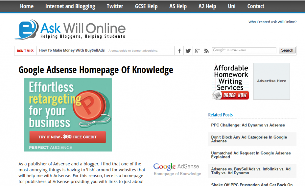
To bring this point across more, let’s take an example of an image advert from my website AskWillOnline.com:
Looking at the second optimisation point, can this image advert be converted to a text advert? Let’s see:
Effortless Retargeting For Your Business
Try it now – $60 free credit.
PerfectAudience.com
This confirms to me that this image advert is well optimised and has all the necessary information to gain a good CTR. Therefore, when you create your own image advert, make sure you try and include the two above points to optimise it.


