Last article in the ‘Analyse A Real PPC Campaign’ series looked at the leaders of most online markets: Amazon. What we found with them was that they do not need a specific landing page that is custom-designed for pay per click advertising. Instead, since 99% of people already know Amazon and what their website looks like, all that Amazon simply needs to do is get that web user onto their website. After that, the categories list to the left will help the web user navigate to an area of Amazon they are most interested in. With the tablet market being hit back by Apple with their new iPad Air, there are a few campaigns out there trying to promote different tablets. One of which is Intel.
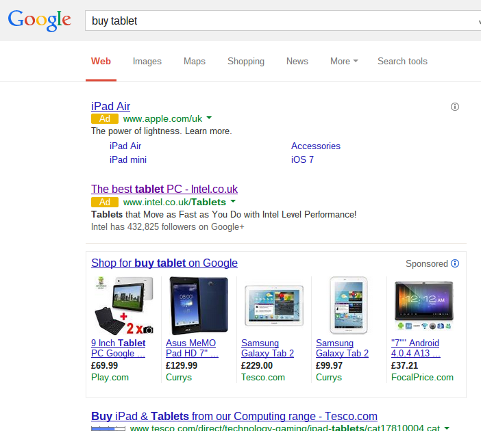
To view Intel’s PPC advert, I had to type ‘buy tablet’ into Google Search UK:
After clicking on the advert, I came to the following landing page:
- Don’t overload with content – It is clear Intel have not done this which is a good thing. They have pictures and different size fonts to show how important it is for the web user to read it. It has content while looking clean which is important aspect to click through pages.
- Remember what your conversion is – A click through page’s conversion is to simply gain a click from a web user.
Looking at point 2, it seems to me that the only link on Intel’s above-the-fold landing page which should be clicked on is the ‘Tablets for every day’. Considering this is most likely what Intel wants the web user to click on out of doing everything on the landing page, it has not been given much significance on the page. For example:
- The link should be larger so it is read nearly first out of all the text on the page.
- It could possibly be in the style of a button to encourage a click.
- It could be different colour to differentiate it much clearer.
Although Intel made the link bold, I still think it needs to be bigger and brighter to encourage more clicks. Not too much bigger and brighter so the button becomes ‘spammy’ looking but just enough to grab the web users attention on the landing page because, at the moment, its hard to see the landing page as a click through page – it could easier be misinterpreted as a bad infomercial page.


