Last in the optimising landing pages series I looked at how to optimise a click through page which has the main objective of gaining a click to 
What is an Infomercial Landing Page
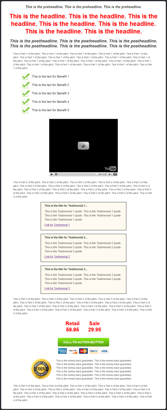
Unlike a click through page, an infomercial’s objective is not to gain a click but to give the web user as much information as possible. Many advertisers think of it as the web-version of a TV advert because it informs the web user. Therefore, many infomercial’s conversions are to get the web users to read the whole page (which can potentially be 5+ page scrolls long) and to get them to stay on the web page as long as possible. To see this type of information, you can install Google Analytics on the landing page and view the above statistics plus more of the landing page.
The main problem with infomercials is that they annoy web users if they are too long and over-advertise what they are trying to advertise. This means that it can be quite difficult keeping web users on them to make sure they read the whole or majority of the content. For this reason, the main objective for advertisers is to try and keep the web user on the infomercial page. The longer they keep them on, the more likely the web user is in buying that product/service.
The 51% Marathon
Like I mention in another of my articles, an infomercial landing page tries to keep web users on the page reading the content by using the 51% marathon rule (that’s how I like to call it anyway). If you run 51% of a marathon, you might as well carrying on running till the end as it will be quicker that way than turning back towards the start line. The same can be applied to an infomercial page. If you make web users think they have read 51% of the infomercial page, they will be far less likely to click away seeing as they think they have read over half of the content and might as well carry on reading till the end.
The idea is that you need to keep the web user thinking that they have read 51% of the content to keep them motivated to reading more.
Images Work Better
It is true that images can be as good as a hundred or thousands words. As well as this, it is much easier and quicker for web users to digest than content. For this reason, make sure to have a good ratio of images to paragraphs. You need to inform the web user but entertain them too as it’s their time that they are giving up to read your infomercial.
Don’t Over-Advertise
A big problem with infomercials is that they seem ‘spammy’ because they over-advertise their product/service to the point where the web user thinks it is too good to be true. Therefore, if you create an infomercial, make sure to make it seem as legitimate as possible. This way, if the web user thinks the product or service is then amazing, they have no reason to think its ‘spammy’ or too good to be true (there is no doubt in their mind as it is the doubt that leads them to exiting the page).


