The last article in my series of ‘Analyse A Real PPC Campaign’ looked at which had a landing page which tempted the web user further into using their service through highlighting the benefits of their service. The last articles such as Panasonic and Argos looked at PPC campaigns that apply to the majority of the public and are price sensitive. For this reason, in this article, I will be looking at the other extreme; a PPC campaign that screams out wealth. Today, I will be looking at how the famous watch company Rolex use PPC to their benefit.
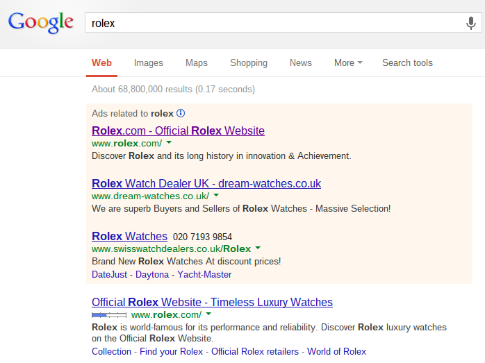
To view Rolex’s PPC campaign, I simple typed in ‘rolex’ into Google search UK:
The first thing I notice is that Rolex are organically in the number one spot already. The reason they have a PPC campaign for their own brand name is so they can become the absolute number one spot for when web users search for their own brand name since there are two other PPC campaigns bidding for ‘Rolex’. For most PPC campaigns, this is not going to be a problem: it is only a problem when the brand image is good and recognised with such examples including Apple, Ferrari and Rolex.
Looking at the text advert itself, Rolex have been clever. They know that Rolex is a branded watch which everyone wants to wear. For this reason, they have tried to mention ‘Rolex’ as many times as possible in the advert. Just doing some quick calculations, the keywords density of ‘Rolex’ in this advert is nearly 30%! That is seriously high!
Rolex also use nice words that are associated with quality and engineering such as ‘Discover’, ‘innovation’ and ‘achievement’. They are portraying themselves as a one of a kind business that come second best to nobody else. They have created a unique selling point of being the best out there at what they do. Why? Because they have been doing it first-grade for so long.
After clicking on the advert, I came to the following landing page:
The centre stage of the landing page has a close up image of one of Rolex’s watches which as you hover over the image it slowly zooms in. This is effective in showing the quality of the watches first hand. You can see the brushed metal and know that every part of the watch has been made to perfection, to the best quality: to Rolex quality.
However, what I am most impressed about is the writing on the landing page, ‘Find your Rolex / May we help you choose your Rolex?‘ This is completely genius because Rolex are trying to connect with the web user by making their shopping experience with Rolex personal. On the internet, this is extremely difficult to achieve. By asking a question such as the one they have asked makes it seem like there are Rolex experts to help tailor-fit a watch to the web user’s needs – brilliant.


