Following on in the series of analysing a real PPC campaign, I am looking at the global brand DKNY and how they are using pay per click advertising campaigns to maximise the success of their business. Before, I looked at Ford and how they were using pay per click advertising to increase the brand exposure of their new range of cars. What I found interesting with them was the fact that their landing page wasn’t specially designed in anyway – it was simply the homepage of Ford. However, if you design your homepage right, it can make for a great landing page too. Anyway, here is DKNY’s PPC campaign: hopefully, they will give us tips and tricks to help us with our own campaigns.
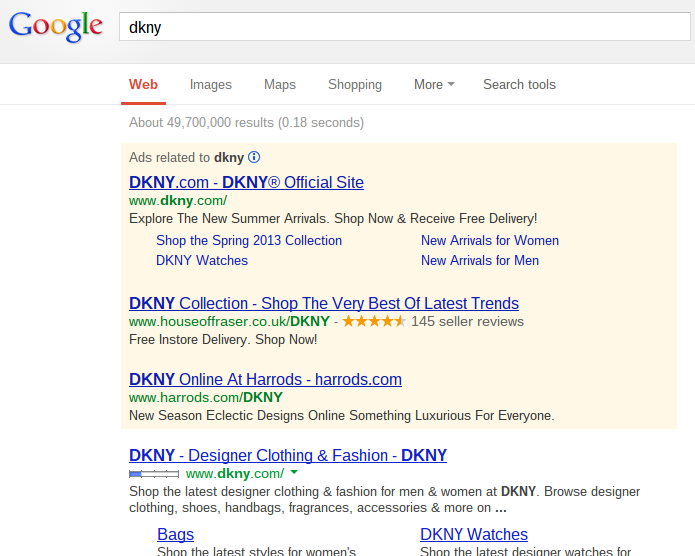
To view DKNY’s PPC text advert, I typed in their brand name ‘dkny’ into Google search UK:
What I found interesting straight away was the fact that DKNY has the number one spot for their own brand name organically. However, there other other advertising campaigns such as Harrods and House of Fraser that are bidding for DKNY’s brand name. Therefore, this means DKNY has to bid for their own name now to make sure customers that wanted to shop DKNY’s collection don’t go to rival competitors. You might think that it’s okay because the other competitors will still be selling DKNY clothes. However, DKNY will have sold them the clothes much cheaper than retail so the competitors can have profit. The profit margin from buying direct frmo DKNY will always be the largest (which is why they want number one spot).
Looking at DKNY’s actual PPC text advert, they have mentioned ‘DKNY’ twice in just their title alone. DKNY is a huge brand name with a large reputation for the clothing industry. This is why they want to mention it as much as possible: they have nothing to be ashamed about their brand image! What I like about the description is that it is up to date from the fact DKNY are mentioning their 2013 summer collection. This makes clear that they keep their PPC campaigns updated (which all advertisers should do). External factors (PETSEL) will make you change your campaign to accommodate the changes.
It’s also interesting DKNY mentions that they have free delivery. For such a large brand name that isn’t always the cheapest, it’s interesting that they are giving web users a financial incentive to shop with them. It just goes to show that everyone has been affected by this double-dip recession.
After clicking on the advert, I came to the following landing page:
I think DKNY have made quite a large mistake. Just from the landing page, I have come straight to the women’s section of DKNY. Not all people who are going to click on the PPC advert will be women DKNY! I’m the proof of that! The PPC campaign must be designed for unisex in mind. It frustrates me even further that the title of the page is, ‘pureDKNY Womens – DKNY’. It’s not a mistake that I have landed onto the women’s section of DKNY. Now, to get to the right landing page, I have to click onto the men’s section. Although it doesn’t sound that bad, I can guarantee that there will be a large percentage of male web users that will click straight away from the landing page after landing on the women’s section because it is too much effort for them (remember web users have a short attention span).
Putting the bad aside, the landing page has a nice simple colour blend of gray and white which fades in and out. DKNY have also put a navigation bar at the top so that even if you have landed on the women’s section, you can still find the section of DKNY you were looking for from clicking on the PPC text advert. I think this campaign makes clear that even if you are targeting at one sex, you cannot guarantee that just that sex will look at it.


