Already I have looked into how to improve a click through and lead capture PPC landing page. By reading these articles, it will become apparent that the best ways to improve these types of landing
The first thing to understand is that a product/service page does not really have a specific conversion. By this, it’s main goal is to inform the web user to a product/service so that he/she can find out features and more about the product or service. If the web user is enticed by the information he or she is reading on the product/service page, the likelihood is that they will have to click onto a link on the page to purchase it, find out more information or sign up to hear updates about the product/service in future. For this reason, it is most like a click through page with a potential hint of a lead capture page. But, at the end of the day, most product/service pages are there to spread information: usually at the start of a product/service life cycle in the development stage.
For this reason, when it comes to optimising a product/service page, you will want to:
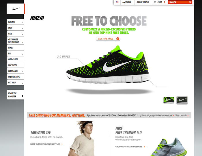
- Keep the web user’s attention – You do not want to bore the web user with lots of content (although you will need to put content on the page at least). For this reason, the best way to keep a web user’s attention on a content-filled page is to change the font of the text depending on what the web user should read first. At the end of the day, you do not need the web user to read every bit of text on a landing page: just the important bits. By varying the font to reflect the importance of the text to read will help make sure the web user reads the most important text first and not become tedious seeing lots of the same size font on the landing page.
- Use floating navigation buttons – If you want an example of what I am talking about, all you have to do is look at Apple. They make it easy for the web user to see lots of information only by either clicking on floating buttons or by simple scrolling down the page. This helps to minimize the amount of content seen first above the content and, as we all know online, first impressions are everything – a web user is more likely to stay on a landing page that has little content above the fold but more below it than a landing page with all the content above the fold.


