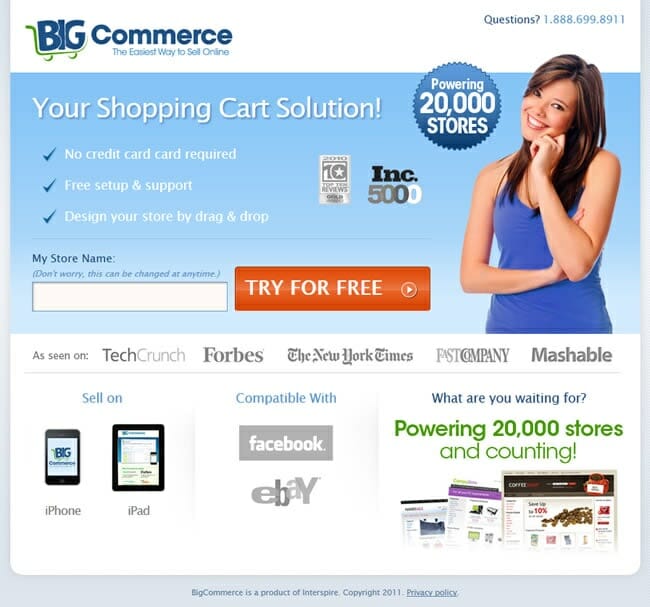
A common type of landing page used by advertisers worldwide in their PPC campaigns is the click through landing page. In essence, the click through landing page is not the actual landing page. I
#1 Include a Call to Action Button
The best click through landing pages I have seen are those that have a call to action button as the button the advertiser wants the web user to click onto. By this, it is a button that continues off from where the search advert started.
If you have optimised your search advert well, you would have included a call to action button in either the title or description that says something along the lines of:
- Buy it now
- Learn more
- Find out how
Automatically, by including this makes the web user want to find out more or buy it now etc. because you are giving them a task to complete. When they click onto the search advert and come to the click through landing page, if they see a button that continues where the call to action in the search advert left off, they are going to want to click it so that it completes the task set where they want to find out more or buy it now etc.
#2 Keep Content Minimal
Remembering what your conversion is (a simple click), you do not want to keep web users on a click through landing page for too long. This is because it is merely a transitional page that is used to lure web users further into your campaign in an attempt that a click through page will help increase the conversion rate. For this reason, do not include too much content. Ideally, you will want the web user to be able to read your click through page within 20 seconds so that they do not exit the page after being bored too easily.
When it comes to click through landing pages, I usually stick to the rule of three with a small paragraph. By this, I will have the call to action button located large and in the prime area of the landing page, three bullet points to entice the web user into clicking the CTA button and a small paragraph if they should so choose to read a tiny bit more.


