The last PPC campaign I analysed in the ‘Analyse A Real PPC Campaign’ series was from ticketbis for the Rio 2016 Olympics, who had a well structured PPC search advert but a very disappointing landing page that, on the whole, looked lazy in design and not optimised at all for PPC traffic. Considering the market online for hosting is extremely competitive, it seems to be a great market to target and analyse a campaign with. Therefore, without further ado, here is an analysis of a PPC campaign by 1&1.
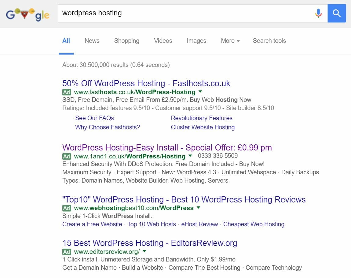
To view 1&1’s PPC search advert, I had to type into Google search UK, ‘wordpress hosting’:
Looking at 1&1’s advert, it is interesting in a few areas and well optimised in other areas:
- I am not too sure why there is a colon between ‘Hosting’ and ‘Easy’ in the title. But, putting that aside, 1&1 have addressed the search phrase at the start of the title and then looked to price sensitive customers at the end (for which the majority of those wanting WordPress hosting will be). Including ‘Special Offer’ will always entice web users since it gives the impression that the good value for money is only available for a limited time only.
- The description is effective since it is used in a way to include many different ‘bullet point styled’ enticements to encourage the web user into a click. As well as this, they have used the call to action ‘Buy Now!’ which is great since this will improve both the CTR of this advert in an easy to integrate/implement manner.
- 1&1 have also included a number to call next to the URL – I am not sure how useful this is: if they have very good customer support (for which they claim as ‘Expert support’), then it could be the USP that sets 1&1 apart from competition.
- There is an extra line in the description which, I feel, is too much content for a search advert. It would have been better if they stuck to two lines only (considering I have, as the web user, already searched for WordPress hosting, I don’t really need to know the other types of services/products 1&1 offer).
After clicking on the above search advert, I came to the following landing page:
- The central location of the landing page contains three reasons why the web user should use 1&1 – the ‘rule of three’ is an effective way to bring across a viewpoint – in this case, that 1&1 are the best for WordPress hosting.
- The use of yellow in the three bullet points makes it seem as if the three bullet points are linked mostly with the ‘PLUS’ hosting package. This is very clever from 1&1 as by doing this they are automatically promoting a package that will make them more money than the ‘BASIC’ package.
On the whole is a beautiful and very effective landing page that will work as a click through landing page to get web users to buy the package that best fits their needs. Apart from some small areas in the search advert, this is a very good overall PPC campaign from 1&1.


