My ‘Analyse A Real PPC Campaign’ series last looked at the bank NatWest who used a colourful landing page to keep the web user from exiting it. What more, it is also clear that the font sizes they choose depended on what they wanted the web user to read first. For example, the largest font is what NatWest wanted the web user to read first and is prioritised above anything else. Including NatWest and the article before (being Rolex), I have been searching for the brand names of the businesses and not competitive keywords associated with the businesses (such as ‘bank loans’ for NatWest or ‘buy high quality watch’ for Rolex’). For this reason, this analysis will consist of me searching for competitive keywords and not a brand name.
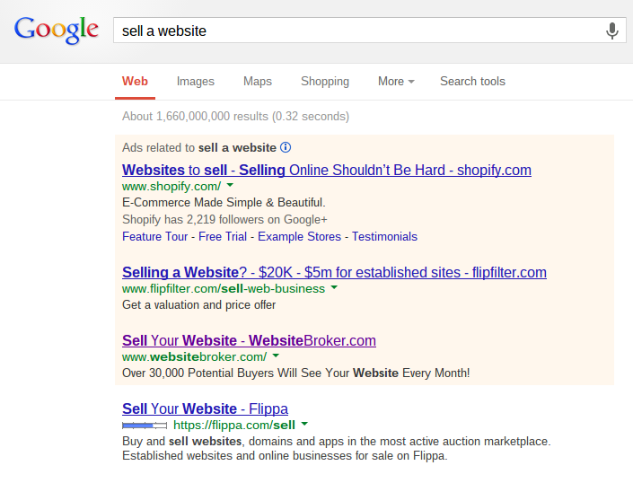
I typed ‘sell a website’ into Google search UK and the following results came up:
Of course, a search phrase such as ‘sell a website’ will have huge competition which is made apparent by there being three adverts above the organic result of Flippa. It is interesting Flippa didn’t choose to run a PPC campaign for ‘sell a website’ possibly because they would always be at least #4 spot for the search phrase.
The PPC campaign I will be looking at is Website Broker’s who are #3. This means they most likely had the lowest CPC out of all three of the paid search results (and therefore get the worst paid search position). What is interesting is that out of all three adverts, Website Broker’s advert is the only one to include a genuine incentive, ‘Over 30,000 Potential Buyers Will See Your Website Every Month!’. By including this incentive will help them gain a reasonable CTR. Having third spot for a paid search is never ideal. However, considering, that the two adverts above them don’t actually include any real incentives or figures, the fact that Website Broker has will work to their advantage.
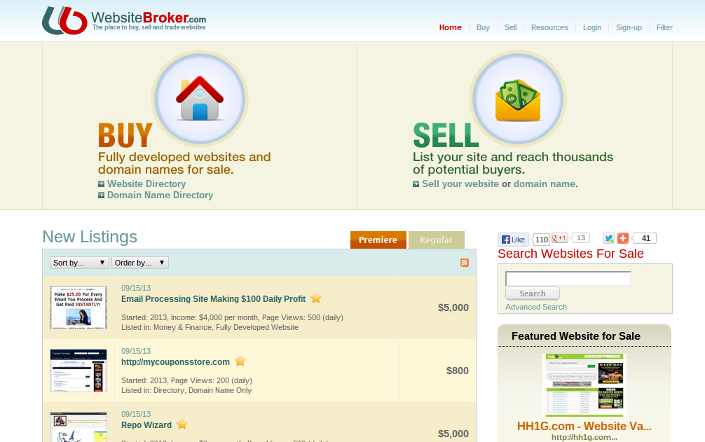
After clicking on Website Broker’s text advert, I came to their following landing page:
This is another PPC campaign which uses their homepage as their landing page too. Although this is not recommended to do, for Website Broker, this could be quite a good idea to do. The homepage of Website Broker’s has the intention to either get the web user to buy or sell a website. Since the conversion is the same for the PPC campaign as it is for the homepage, they can use their homepage as their landing page. This brings forward the tip that you can only use your homepage as your PPC landing page if the conversion for both your landing page and homepage is exactly the same.
The landing page is well designed as it is. The main focus area is where the largest font is being ‘BUY’ and ‘SELL’. Website Broker is addressing both types of web users that are coming onto their website: ones who want to buy websites and ones who want to sell websites. Looking at the page itself though, it is clear it is a click through page from the fact the web user will have to click on another link to actually start the process to buy or sell a website.


