The last PPC campaign I analysed in the ‘Analyse A Real PPC Campaign’ series was from Harveys, who had an effective PPC search advert and a landing page which brought around tips PPC advertisers could use to improve their own landing pages, to encourage web users to look at the areas of the landing page the advertiser wants them to look at. A steady market has always been the currency exchange market, simply because the world is never going to have one universal form of currency! For this reason, here is a look into such a market and an analysis into a PPC campaign from torfx.
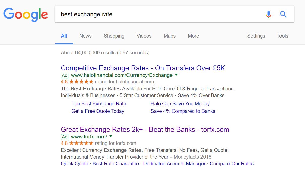
To view torfx’s PPC search advert, I had to type into Google search UK, ‘best exchange rate’:
Looking at torfx’s advert, it seems to have many enticements to get the web user into a click, mainly in the description and the fact they were the ‘International Money Transfer Provider of the Year’. However, I feel a little confused by the advert in the whole. I only understood ‘2k+’ referred to exchanging money between currencies of more than £2000 from looking at the above advert. As well as this, I am not totally sure by what torfx mean by ‘Beat the banks’ – what about all of the currency exchange companies that are not banks? This brings around the point that enticements are only good in PPC as long as you make it black and white and easy to understand for every web user that could possibly read the advert.
After clicking onto the above advert, I came to the following landing page:
- Easy to use
- Is possible to do no matter how old you are
- Is a joyful experience to use
- Will not be disappointed from using the service
- Is easily accessible online
The drop down menu to the right is a great way to specify exactly what the web user is after, which provides a much more specific secondary landing page for web users to land onto, improving the chances of a conversion (where the web user exchanges currency with torfx).
My only disappointment with this landing page is, like with many that have been analysed, that there is lots of content below the fold of the page. There is no sign above the fold of this which could mean many web users simply fill the form in and progress to the secondary landing page without reading more enticements to use torfx.


