In the last article of the ‘Analyse A Real PPC Campaign’, I analysed Blurb’s campaign which had a well optimised click through/infomercial landing page that would have really made their campaign a success in gaining conversions. With the summer holidays just starting, I thought it would only be right to look at a campaign that was about holidays. For this reason, here is an analysis of Thomas Cook’s PPC campaign.
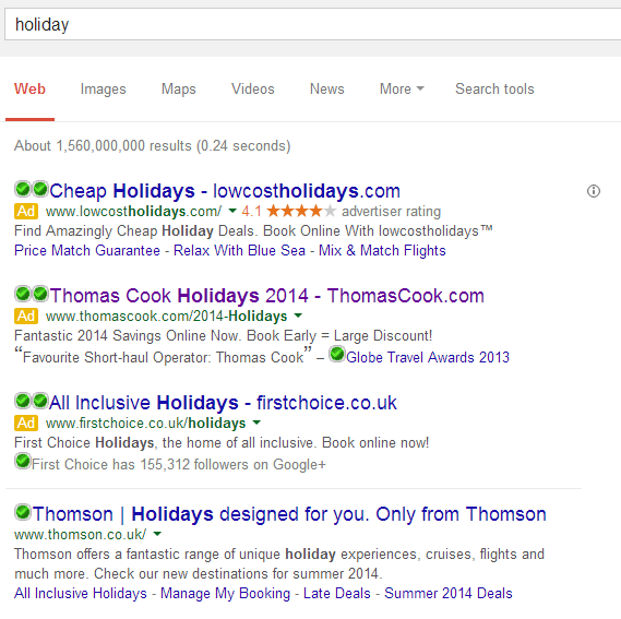
To view Thomas Cook’s PPC search advert, I had to type ‘holiday’ into Google search UK:
Looking at the advert itself, they have used what seems like simple maths to make clear that they are financially the best place to go to for holidays, ‘Book Early – Large Discount!’. What is also interesting is the fast that Thomas Cook chose to put their URL in the title of their advert. This is so that web users will see the URL, remember it and go to their website directly in future if they want to book holidays. A clever technique to say the least which the other PPC campaigns also implemented.
Thomas Cook have also used the review extension to display a positive review from Globe Travel Awards 2013. This is a great use of the ad extensions since it makes Thomas Cook seem the first choice when it comes to booking short-haul holidays.
After clicking on their search advert, I came to the following landing page:
- The colour scheme of the page is minimalistic but colourful at the same time: using yellow mostly since this is the colour of the sun and represents summer and warmth.
- There is a navigation tab at the top of the page with buttons to different areas of Thomas Cook’s website so the web user can completely explore the website from just this landing page.
- The ‘Summer 2014 School Holidays’ image is actually a slideshow displaying three different holiday destinations with prices.
- There is text in the middle to entice the web user into wanting a holiday through Thomas Cook.
- The left hand side has a lead capture area to help the web user find their perfect holiday.
Whatever way you look at this landing page, it is class. It accommodates just about every web user and is colourful yet simple to look at which will definitely help with reducing the exit rate.


