
Tag Heuer – Analyse A Real PPC Campaign 18 Feb 2016
The last PPC campaign analysed in the ‘Analyse A Real PPC Campaign’ series was by TitanBet, who had an ‘okay’ search advert and a brilliant landing page that had many good areas PPC advertisers can take away to use in their own respective campaign. With this article being created on Sunday 14th February, I thought it would be a good idea to link it to it being written on Valentine’s Day. Therefore, without further ado, here is a PPC campaign analysis from Tag Heuer.
To view Tag Heuer’s PPC search advert, I had to type into Google search UK, ‘valentines day gifts’:
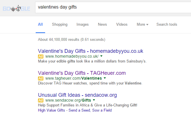 It is a necessity to use a PPC campaign for promoting Valentine Day gifts since it would take a lot of work to generate traffic from search engines the organic way (hence why there is a lot of competition here too). This search advert by Tag Heuer is a good example of sometimes where simplicity can often be just as effective as overloading an advert with content and ad extensions:
- Tag Heuer addresses Valentine’s Day both at the start of the title and end of the description and URL to make the advert seem something very close to what the web user was searching for.
- The description features two call to actions, which is on the upper limit of what I feel can be the maximum number of call to actions in an advert. Even with the maximum in the advert, the description is very short and to the point.
- The title has the URL of Tag Heuer’s homepage to give web users the option to go directly there if they choose not to click onto the advert. As well as this, it helps spread brand awareness.
After clicking on the above advert, I came to the following landing page:
 This is a, on the whole, well designed landing page in general. The idea behind this is to let the web user browse the collection of watches Tag Heuer are offering using the top navigation menu. The center image of the two watches in the shape of a love heart is also a nice touch. However, I am a bit confused why the watches are causing cracks at the bottom as that is something that could represent a broken relationship (unlike what Tag Heuer want to associate it with, which is ‘Will you crack under pressure?’) – just an interpretation!
However, there are definitely some areas of improve. Valentine’s day is option associated with red. Therefore, I feel there should be much more red in the landing page, possibly in the image, to home in to web users that this gift is for their Valentine. As well as this, I would definitely remove the cracks from the image too!
Putting these two points aside, the landing page actually has quite a lot of content relating to Valentine’s day below the fold of the page. The problem is that the web user, from landing onto this page, have no idea that there is more content below the fold. Therefore, I would either make sure the image displays partly below the fold of the content of include some sort of arrow to suggest there is content below the fold.
Will Green
Will created Ask Will Online back in 2010 to help students revise and bloggers make money developing himself into an expert in PPC, blogging SEO, and online marketing. He now runs others websites such as Poem Analysis, Book Analysis, and Ocean Info. You can follow him @willGreeny.
|
Recommended posts
|
