The last article in the ‘Analyse A Real PPC Campaign’ looked at Netflix who had created an excellent campaign that stood out for its simple and image-rich landing page. In the last few articles, I have been searching for relative keywords instead of the brand name of the company. Although it is useful to bid for your own brand name (especially if competitors are doing the same), campaigns that are bidding for relevant keywords can sometimes prove more useful as they are directly battling against other competitors whereas if the web user searched for your brand name, it is obvious you have an advantage as they specifically want to find your company.
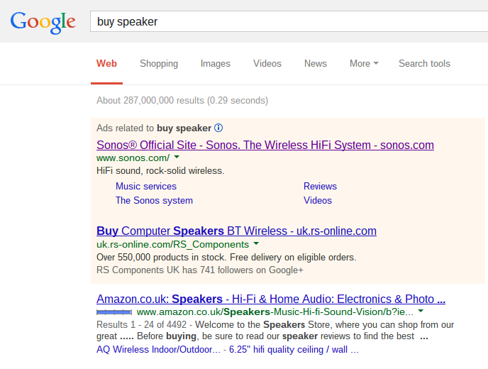
In this article, I am going to look at Sonos’s campaign which is a company that makes wireless Hifi systems. To view their search advert, I had to type into Google search UK, ‘buy speaker’: Considering how general a search phrase ‘buy speaker’ is, it is lucky that Sonos has got top spot. Well, it’s not luck: it is a high CPC they have most likely adopted and since Sonos do not organically show up on the first page of results, if they want to get traffic from this keyword, it will gave to be at a price through PPC. The only question I am left asking is ‘should they even bid for the search phrase?’ It is a very general phrase and since Sonos are centred around Hifi systems, anyone who doesn’t want a Hifi sound system will be wasted traffic if they click on the advert. There are so many different types of speakers out there. For me, the search phrase is too vague to bid on.
After click on the advert, I came to the following landing page:
Looking at the landing page as a whole, it is very simple, just like Netflix, which will work to Sonos’s advantage. They have displayed their full range of products in one image without over-clustering the landing page while also providing a simple and elegant navigation menu with oversized buttons.
This brings me onto a common problem with landing pages. Sometimes, advertisers put too much information on them which makes it quite overwhelming for the web user to digest it all in. In these cases, the web user will either scan the page missing out potentially key information or simply exit the page and look for the next best alternative. This is why the landing page Sonos have created is really good. Not only do they display their whole product line above the fold, they have done so while making the landing look clean and space free: something which will definitely keep the web user hooked longer onto their landing page.


