The last PPC campaign I analysed in the ‘Analyse A Real PPC Campaign’ series was from Virgin Games, who had a well designed search advert and a good landing page too. However, the terms and conditions of the offer was above the fold of the page, where it could have been placed below the fold to reduce the content and small print above the fold.
Although Summer 2017 is vast approaching, there is still some time (and some places in the world) to go on a skiing holiday. Therefore, without further ado, here is an analysis of a PPC campaign from Skiworld.
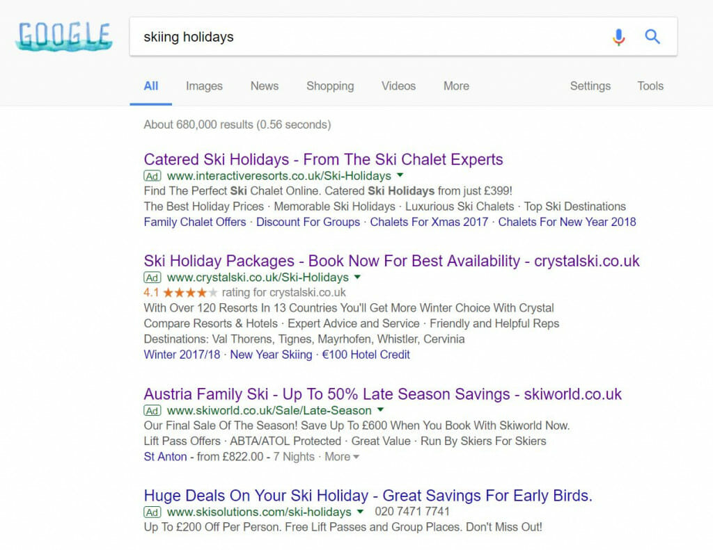
To view Skiworld’s PPC search advert, I had to type into Google search UK, ‘skiing holidays’:
Looking at the advert itself, it seems to want to clutter in as much information as possible, in attempt to get a click onto it. A problem that appears in the title is the fact that:
- Skiworld have mentioned a location. This already prevents a lot of web users from clicking on the advert if they did not plan on wanting to ski in Austria (there are many places one can ski).
- Skiworld mentioned the word ‘Family’. Again, this will put certain people off that had the idea of skiing with their friends, colleagues and more.
Therefore, the targeting of this advert could have been improved if it focused on family skiing trips or Austrian skiing trips. Having appear just for skiing holidays will cause the CTR to drop.
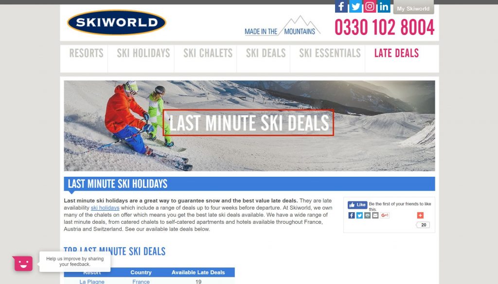
After clicking on the above advert, I came to the following landing page:
- There is far too much content on this landing page. This landing page is not meant to advertise and promote why people should go on a skiing holiday. Instead, it should be a lead capture page, allowing the web user to find dates of a skiing holiday and then view the results of what is available. The fact that there is not even a lead capture section makes clear that this is a click through landing page. But, what does Skiworld want the web user to click on? Nothing springs out as an obvious click to the next section.
- The theme of the landing page is pretty plain and simple. With snow being white, it could have been more beneficial to include a more ‘wintery’ theme rather than a dull grey background.
The saving grace of this landing page is the menu, which is clear and large to read, featuring an expansion on hovering. Therefore, if the web user does interact with the navigation menu at the top, they are likely to still have a good experience with Skiworld.


