The last article to be analysed in the ‘Analysed A Real PPC Campaign’ series looked at SocialBro, who had both a well designed search advert and landing page: the search advert was dense with the brand name ‘SocialBro’ while the landing page was an effective click through page. In this article, with the start of the Formula One season fast approaching, I thought it would be interesting to see the types of PPC campaigns that appear so early on in F1. In this article, I am going to be analysing a campaign by Singapore GP.
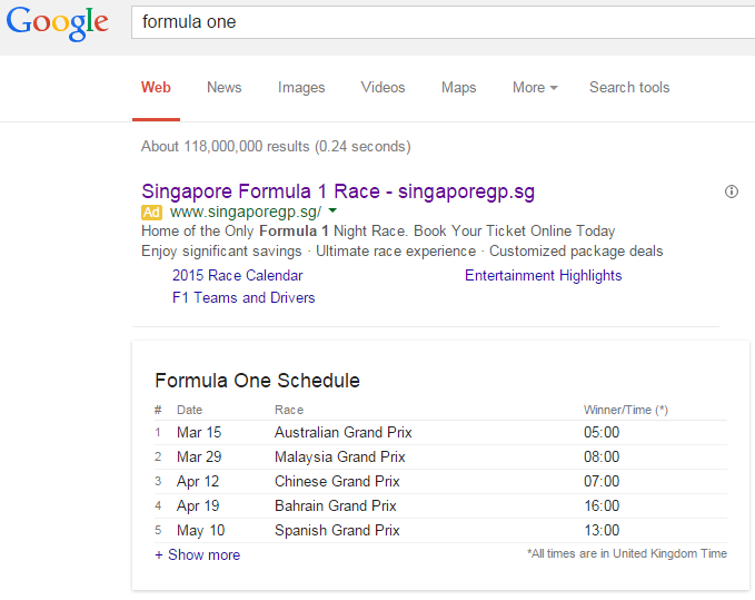
To view Singapore GP’s PPC search advert, I had to type into Google search UK, ‘formula one’: Straight away, Google pops up with a Formula One schedule since the majority of people that will be searching ‘formula one’ will be interested to know when the season starts and where. However, there will be some people that would be wanting to buy tickets before the new season – Singapore GP are trying to lure potentially interested Formula One fans into buying tickets to their race this year.
Looking at the advert itself, it is well designed for the following reasons:
- Site link extensions – The advert lets the web user click onto three extra related links.
- Call to action – There is a call to action in the first line of the description.
- Rule of three – Singapore GP are tying to lure the web user in by using the rule of three: three beneficial points to what Singapore GP are offering.
- Brand awareness – The title and URL are based around publicising the brand of Singapore GP.
After clicking on the above advert, I came to the following landing page: With this landing page, I found the following points:
- The landing page is very premium in its theme – this helps to make Formula One in Singapore seem premium which will help to argue the price tag for the tickets (which will be quite high).
- They have included social media plugins onto the landing page to help spread awareness for the Singapore GP. This will work well for them since they will be, in essence, gaining extra contextual traffic for free.
- The landing page entices the web user to scroll down the page which shows a wide selection of options he or she can click and choose from.
- However, I am slightly confused what the conversion is for this landing page. In the bottom left corner of the landing page is a button which allows the web user to browse tickets. Now, if the conversion is a ticket sale and this is a click through landing page, the button for this page way to small, poorly located and does not stand out enough to obtain a high CTR.


You must be logged in to post a commentLogin