The last article in the ‘Analyse A Real PPC Campaign’ series had a look at Wren Living: a company that sells furniture. What we noticed was that both the search advert and landing page that was adopted for PPC worked very well for a number of reasons (which you can find out by reading the article). With summer coming to an end, I thought it would be a good idea to see how advertisers adapt their campaigns to accommodate the changing four seasons. For this reason, I looked at the clothing industry.
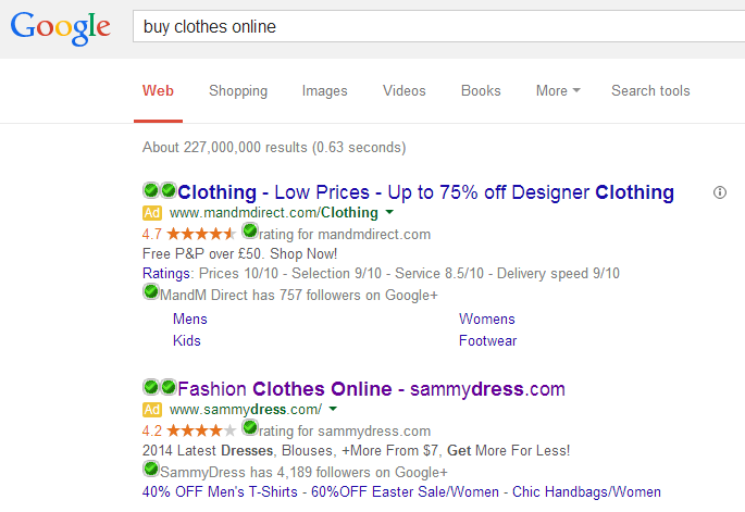
To view a number of search adverts based on clothes, I typed into Google Search UK, ‘buy clothes online’: The first thing I notice is that there are no adverts about the changing seasons! Since many people have bought summer clothing for summer, and summer is ending, people will be wanting to buy autumn clothing for them colder nights. It seems to me that advertisers haven’t picked up on this yet…
I will be looking at SammyDress’s PPC campaign. Their advert is filled to the brim with information:
- They have used three ad extensions being the ratings, extra links and Google + extensions. This will help web users build confidence with SammyDress and go to a page tailored more to the web user (resulting in a better CTR).
- They have a being ‘Get More For Less!’
However, they have only targeted women. This is clear since the URL and description has ‘dress’ in it (and I don’t think there are many men that wear dresses!). As well as this, I am in the UK. Why is the currency in dollars? There are a few bad mistakes in this advert.
After clicking on the advert, I came to the following landing page: Straight away, there are a few things I notice:
- SammyDress offers both women and men clothing. Therefore, why is the PPC text advert so dominated towards women clothing? This is surely going to affect the clicks from men.
- SammyDress offers more than one currency which is clear from the drop down menu of currencies in the top right of the landing page. Therefore, why mention a currency at all in the PPC text advert if the advert is reaching people globally such as myself?
Unfortunately, it does seem like these are rookie errors I hope they change. The only consolation is that at least the landing page is dominated by women clothing from the slideshow images and bright and vibrant colours considering the search advert is all about women clothing.
However, if SammyDress offer clothing to both sexes, why not either make a campaign to accommodate both sexes better or make separate campaigns for each sex? I guess the area that they have shot themselves in the foot is with the URL of their website: sammydress.com. It doesn’t scream out ‘clothing for men’, does it? If they want to encourage men to shop on their website, it might be a good idea to rethink the URL…


You must be logged in to post a commentLogin