The last article in the ‘Analyse A Real Campaign’ series looked at Sanex who had a very clean, spacious and minimalistic design as a landing page to help promote the fact their products are about cleanliness etc. However, they did not have any call to action in their search advert so there were a few areas Sanex could have improved upon. In this article, I am going to be looking into the protein market for those that need a bit more muscle. Therefore, without further ado, here is an analysis of a campaign by The Protein Works.
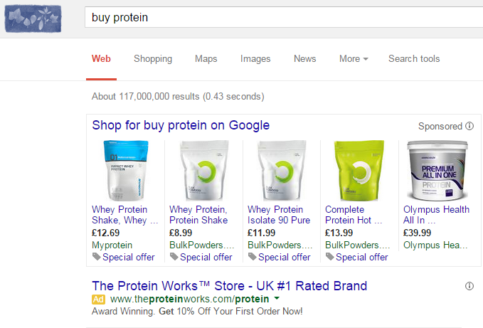
To view The Protein Works’ PPC search advert, I had to type into Google search UK, ‘buy protein’: The first thing I wanted to check with this advert was the fact whether The Protein Works appeared organically on the first page or not…which it does not. Therefore, they already have a really good reason for having a PPC campaign for such a keyword phrase: to steal traffic from the high ranking organic results that can be deemed to be their online competitors also in the protein market.
The only problem with this is that The Protein Works’ advert is the only ‘bog standard’ advert appearing on the results. Above the advert are images and prices of protein powder that is being sponsored through Google shopping. This means if The Protein Works wants to compete with the results above and below them, they will have to be price sensitive (which they have done through the offer in the description) and make clear they are the market leaders in protein (which they have done through claiming in the title that they are the ‘UK #1 Rated Brand’). They have mentioned protein numerous times throughout the advert and have a call to action in the description. Therefore, it seems The Protein Works has done a good job of a search advert for their campaign.
After clicking on the above advert, I came to the following landing page: Just with a quick glance, it appears that The Protein Works have made an excellent landing page for the following reasons:
- They have an offer which will entice the web user to using their service since they will get discount.
- They have excellent customer service by enabling the web user to talk to one of the members of The Protein Work’s staff for help through the chat pop-up in the bottom right corner.
- They use the rule of three to make clear why their protein is the best.
- The theming of the landing page is complimentary: not too colourful but not too bleak.
- The web user has access to any part of the website through the interactive navigation menu.
- There are numerous areas on the landing page that illustrate The Protein Work’s high quality and awarding winning protein which will work wonders in enticing the web user into buying the protein mix.
Overall, this a very well optimise campaign!


You must be logged in to post a commentLogin