
Plus500 – Analyse A Real PPC Campaign 01 Dec 2016
The last PPC campaign I analysed in the ‘Analyse A Real PPC Campaign series was from Pines and Needles, who had a great PPC campaign on the whole. Their search advert used great ad extensions for what Pines and Needles were promoting and the landing page was a brilliant example of a click through landing page that had the aim to split the traffic into two more specific areas of the website. In this article, I will be looking at a PPC campaign from a company offering the web user a service to buy and sell stocks and shares. Therefore, without further ado, here is an analysis of a PPC campaign from Plus500.
To view Plus500’s PPC search advert, I had to type into Google search UK, ‘buy stocks and shares’:
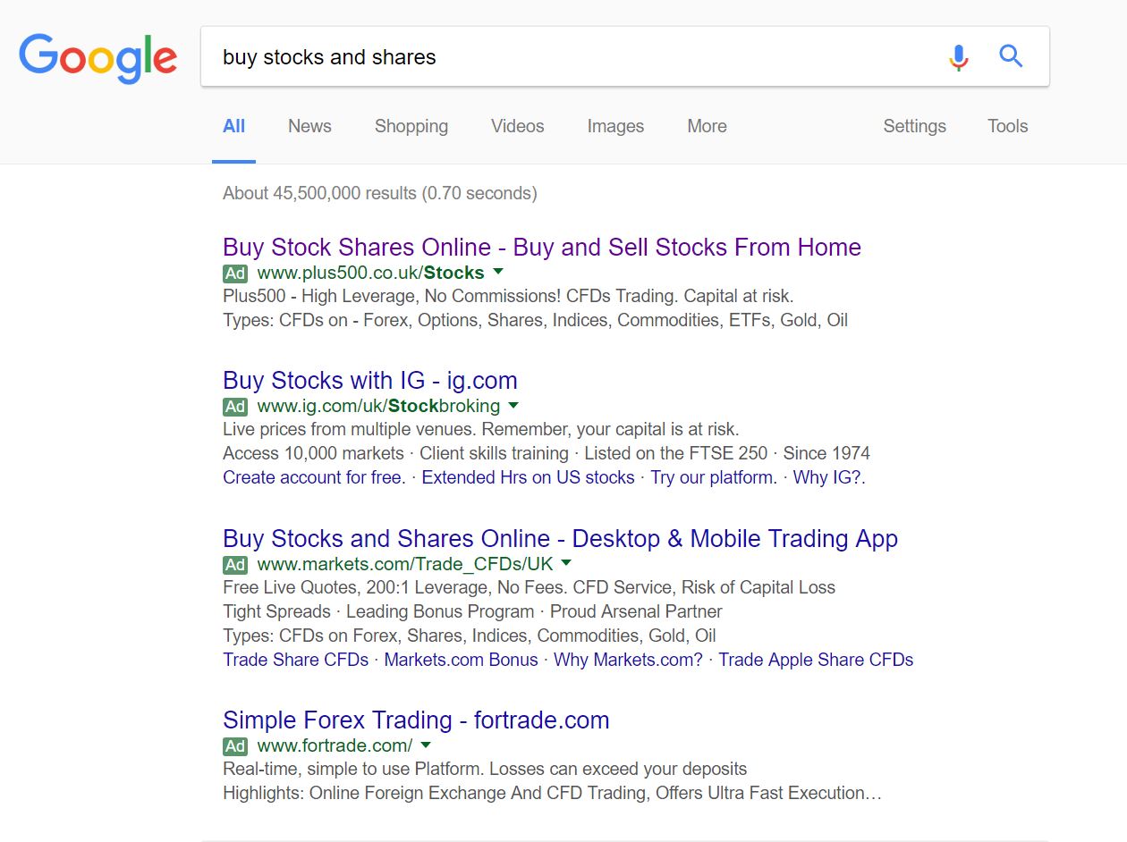 From checking the first pages of search results, it is apparent that Plus500 have this PPC campaign in order to gain traffic for such a crucial keyword search phrase that they do not rank highly for organically. Unfortunately for them, the competition for such a search phrase is also very high, which will likely mean the CPC that Plus500 had to adopt in order to get top spot would have been expensive for this sector.
Looking at the advert itself, the advert is all about the call to actions in the title and then the USPs of Plus500 in the description. Unlike other campaigns I have analysed in the past, Plus500 have not used their brand name as a selling point to attract web users. Instead, they have gone the more contextual route, completely addressing what the web user searched for. This will help Plus500’s advert in getting a high click through rate: especially through the use of two contextual call to actions for the title.
After clicking on the above advert, I came to the following landing page:
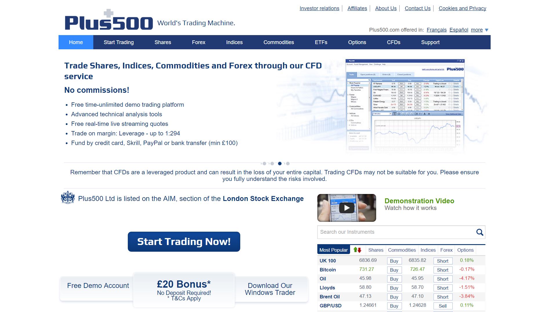 It is clear front the contents of this landing page that this is, in fact, a click through landing page. With this in mind, this landing page has both pros and cons associated to it:
- It is good that Plus500 have a navigation menu. However, it is not floating or expands on hovering, limiting the usability of it. As well as this, the links chosen are not the most helpful for web users first getting into buying and selling stocks.
- The use of a slideshow behind the navigation menu will attract the web user’s attention, enabling Plus500 to show off a few of the reasons why the web user should buy and sell stocks with them over competitors. Slideshows are good, for this reason, at providing information on landing pages without taking up too much area.
- The only problem with this landing page is with the actual button Plus500 want the web users to click onto. For me, it is too small and not in a nice location to get a high CTR. Therefore, if I was to optimise this landing page, it would be to either stick the button more centrally, higher up the page and make it a little larger.
Will Green
Will created Ask Will Online back in 2010 to help students revise and bloggers make money developing himself into an expert in PPC, blogging SEO, and online marketing. He now runs others websites such as Poem Analysis, Book Analysis, and Ocean Info. You can follow him @willGreeny.
|
Recommended posts
|
