Last article in the ‘Analyse A Real PPC Campaign’ looked at Sonos and their Hi-Fi sound systems and what we found was a clever choice of background colours for their landing page to promote the brand image of their systems.
I thought it would be a good idea to analyse a campaign on smart watches since this is a new an emerging technological market with the likes of Samsung, Sony and Apple (yet to be announced from them) entering. Since we gathered that the product life cycle is an important aspect to consider when creating a PPC campaign, it can be seen that all smart watches are in the introductory stage of their life cycle. Therefore, a PPC campaign is a necessity to have in order to spread awareness of this new and emerging type of product.
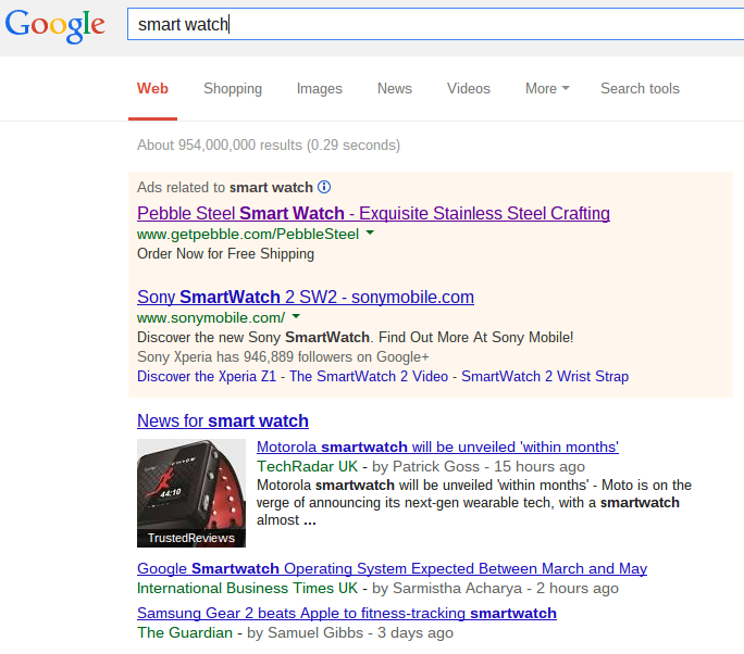
To view smart watch PPC campaign’s, I typed into Google search UK, ‘smart watch’:
Considering what I just said about this market being in the introductory stage, I am very surprised Samsung has not produced their own campaign for a smart watch since they were the first to release one!
Putting this aside, Sony has a campaign for their new smart watch and so does Pebble. It was a good idea for Pebble to adopt a higher CPC to gain top spot since Sony is a more recognised name than Pebble: to get people to click on their advert over Sony’s they will need an incentive or a better location than Sony.
What is good about the advert is that it doesn’t give anything away about the smart watch except for that it is made from stainless steel. This produces a lot of alliteration which is a good technique for making something sound that bit better. As well as this, there is a call to action in the description which is great as it gives the web user an instruction of what they need to do.
After clicking on the above advert, I came onto the following landing page: Over the whole duration of my ‘Analyse A Real PPC Campaign’, this is the first landing page to have an embedded video on it! Images are a thousand words…how many words is a video? The sky is the limit. Therefore, if you want to save space, a video on the landing page will do you wonders in giving the web user information in a easy way (since reading can be quite tedious).
The design of the landing page is great. There are navigation buttons at the top, a bullet point list of the features of the smart watch and a ‘Order Now’ button making clear that this is a click through page. It’s objective is to lure you further into wanting the smart watch by giving the web user more information. The conversion is a click on the ‘Order Now’ button. So well done Pebble, it’s looking to be quite an effective landing page! The only downside is that they haven’t got dedicated landing page’s based on where you live: not every country has the dollar currency!


You must be logged in to post a commentLogin