The last campaign I analysed in the ‘Analyse A Real PPC Campaign’ was from Euro Car Parts, who did not have the best of campaigns in general since both the search advert and landing page Euro Car Parts used had areas of improvement to them. In this article, with it getting ever closer to the 31st October, I thought it would be a good idea to see the type of campaigns that appeared for the Halloween rush. Therefore, without further ado, here is a PPC campaign analysis of Party Delights.
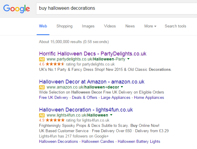
To view Party Delights’ PPC search advert, I had to type into Google search UK, ‘buy halloween decorations’:
Looking at Party Delights’ advert itself, it ranks number one and does not use any type of ad extension. Although in the past I have said that adverts should use at least one type of ad extension as they will benefit the click through rate greatly, I can see why Party Delights chose not to. They have made their advert look very simple and not rich in text so out of the three adverts displayed, it is the easiest to read and digest (which will result in web users reading it first). So, I guess, in some cases, where the general market of adverts use ad extensions, it is sometimes good not to use any ad extensions to differentiate yourself from competitors.
After clicking on the above advert, I came to the following landing page:
- The central area is filled with images of Halloween decorations which will keep the web user on the landing page for longer (as it directly matches what he or she searched for on Google).
- Above the images is a red band outlining a discount Party Delight are offering. We all know that everyone loves a discount code as it makes them feel they are saving tons of money (and it also keeps the web user on the landing page for longer so a very clever tactic too).
- The navigation menu is both to the left and top of the landing page, showing many options to which the web user could click onto.
- Some of the images are cut off which will entice the web user to scrolling down the landing page to see the content below the fold. This will enable Party Delights to advertise their full and complete range of Halloween decorations.


