Last time in the ‘Analyse A Real PPC Campaign’ series, I looked at Argos which had, what I felt was, a pretty pointless campaign considering that they made a bid for the keyword ‘Argos.co.uk’. One of the most important elements to a PPC campaign is the keyword selection: if you choose the wrong keywords, you will gain clicks from web users that are likely to not be interested in the contents of your landing page. For this reason, in this article, I will be looking at a campaign which has used keywords that are not related to the brand name at all of the business but the product they are trying to sell. This is what the majority of advertisers do in PPC and it is where competition for keywords most occurs.
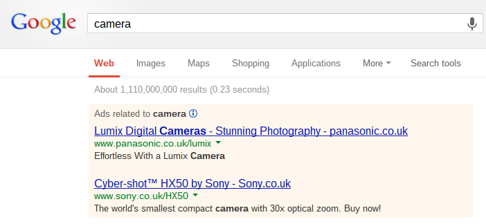
So, I decided to type in a very vague keyword into Google search UK being ‘camera’ and I got the following results:
As predicted, the vague keyword ‘camera’ has competition for it from Sony and Panasonic. Since I have already looked at one of Sony’s PPC campaigns in the past, I will be looking at Panasonic. The first thing that is clear is that Panasonic have outbid Sony for the prime location. When looking at the text advert itself, they have decided to be top heavy on content in the title and keep the description relatively short. A reason for this is because the title is much more likely to be read than the description. Therefore, if you want to guarantee something to be read in your PPC advert, put it in the title. The description is only there to provide more information to the web user about the contents in the title. This is why the title is packed full of information:
- ‘Lumix Digital Cameras’ – The web users now knows the product’s name.
- ‘Stunning Photography’ – How is it ‘stunning’? We are intrigued by this statement and are enticed into wanting this camera if it produces ‘stunning photography’.
- ‘panasonic.co.uk’ – If the web user does not decide to click on the advert, they can at least know where to find the camera in the future.
This is a good strategy for PPC if you find your search advert is struggling to gain a respective CTR. Bombarding your title with the information leaving your description clean and short can have the potential to gain your advert a much higher CTR.
From clicking on the advert, I came to the following landing page:
With most landing pages, they will adopt some sort of large slideshow to display more information that can be fitted onto the landing page in a clean manner. This can be said with Panasonic who have a five image slideshow in a prime location on the landing page. Above this slideshow are the internal links to other areas of the website and below it are the ‘nitty gritty’ specifications and more information on the cameras.
This landing page is designed well. The area which web users are most likely to look at first is covered by a colourful and animated slideshow. Above this is the stereotypical place for more internal links to other areas of Panasonic’s website and below the fold holds more information on the cameras. If you are unsure about the design of your landing page when trying to promote and sell a product, take a tip from Panasonic. Grab the web users attention first and place the technical stuff below the fold so that the web user has to scroll to view it.


You must be logged in to post a commentLogin