In the last few articles of the series ‘Analyse A Real PPC Campaign’, I have been looking at campaigns that have had to fight with other PPC advertisers for their positions on paid search results (examples include Twitter and ASOS). For this article, I am going to change things up a bit and look for a PPC campaign that has no competition against it in paid search results at all. This led me to analyse Olay’s PPC campaign.
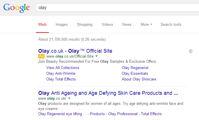
To view Olay’s PPC search advert, I had to type into Google search UK, ‘olay’:
It always seems strange for a business to bid on their own brand name. However, there are legitimate reasons why Olay have done this:
- To scare off advertisers – Competitors tend to bid on other brand names that could be associated with them or are in the same market as them (in an attempt to ‘steal’ traffic). By Olay making a campaign for the term ‘olay’, they are sending out a message to competitors that there is no point bidding for ‘olay’ since Olay are doing that already.
- To send web users to a specific page – Organically, the first page that appears is Olay’s homepage. This is good for Olay since their landing page will offer many links to different pathways into their website. However, if Olay want to get web users to a specific page, such as the launch of a new cream, this will have to be done through PPC.
Looking at Olay’s advert itself, they have mentioned their brand name all over the advert. This is an effective strategy if your brand name is a market leader like Olay’s is. As well as this, they have also used an ad extension which includes many more links to different areas of the website.
This could be one of the main reasons Olay made a PPC campaign for their own brand name: by clicking on the advert takes the web user to the homepage of Olay (which is where the first result organically would take the web user). Therefore, it is clear that Olay wanted to have more specialised links ranked first on Google and to do this, they had to create a campaign for their own brand name and include the ad extension of extra links in the PPC text advert.
After clicking on the following PPC search advert, I came to the following landing page: Already, we know this as the homepage for Olay as well as the landing page for this campaign. Looking at it as a landing page, though, it is clear it could be seen as a hybrid between a click through page and an informercial page. I say this because there are opportunities for the web user to click on links to explore the web user. However, the main attraction of the web page is the slideshow of images. Every 5-6 seconds, the image fades out to display information on a different product of Olay, helping to portray lots of information to the web user in a short amount of time.


You must be logged in to post a commentLogin