The last PPC campaign I analysed in the ‘Analyse A Real PPC Campaign’ series came form MandM Direct, who had dominated paid results by displaying the only PPC advert for the search phrase ‘buy running shoes’ as well as crowding out Google sponsored shopping results with two pairs of running shoes too. However, the landing page was an ‘average’ page since it had a few areas of improvement. The food industry online is a competitive one offering home deliveries for grocery shopping. However, if you are vegetarian, it can be considered that this would be hitting a niche of the food industry. Therefore, looking into this sector, here is an analysis of a PPC campaign by Ocado.
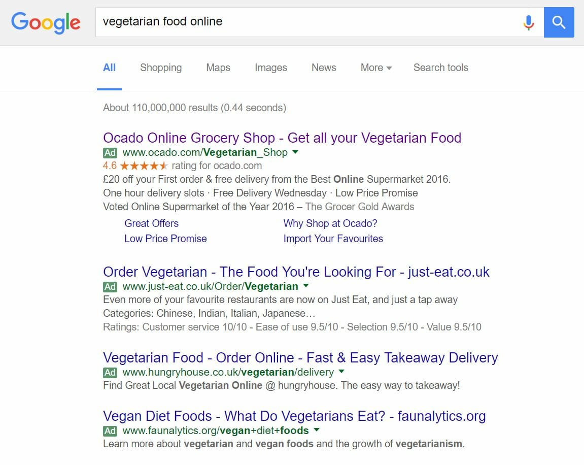
To view Ocado’s PPC search advert, I had to type into Google search UK, ‘vegetarian food online’:
What Ocado have done in this situation is very clever. From gaining top spot, they have opted to also use site link, reviews and ratings extension, which add more enticements to get the web user to click onto the advert as well as make the advert larger too. This has forced the other three adverts to move further down the results page, to the point that in order to see faunalytics.org’s PPC search advert, I had to switch my browser to full screen to fit it in the image. Therefore, I would not be surprised at all if Ocado gained an incredible click through rate for such an advert.
Looking at the advert, it addresses exactly what the web user searched for, includes a promotional discount and call to actions to get that click from the web user. So, on the whole, this is a very well optimised search advert.
After clicking on the above advert, I came to the following landing page:


Nick
November 24, 2016 at 3:23 am
Hi,
Thank you for the info.
I will add some of this on my site to help visitors better create their PPC Campaigns.
Regards