The last PPC campaign I analysed in the ‘Analyse A Real PPC Campaign’ series was by Save The Children, who had generally a very good advert and landing page to gain the conversion they were after: a donation. With the Christmas rush already starting and feeling like earlier than any other year, I thought it would suit the series to start the analysis of Christmas PPC campaigns. The Christmas rush is crucial to so many companies because the majority of many companies’ profit come from Christmas shopping. Therefore, the campaign we are going to analyse, from NotOnTheHighStreet.com, needs to be as close to perfect as possible as any small errors in the campaign will be magnified due to the fact so much is relied on this PPC campaign. The PPC campaign I am going to be analysing, as stated, is from NotOnTheHighStreet.com.
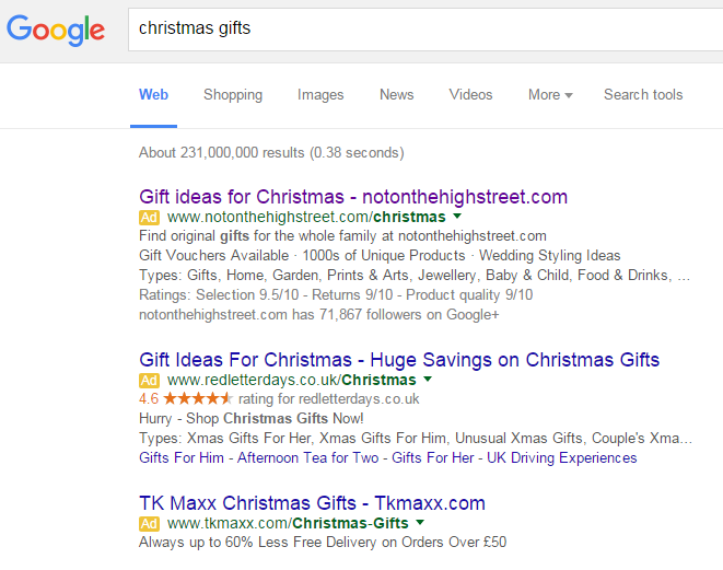
To view NotOnTheHighStreet.com’s search advert, I had to type into Google search UK, ‘christmas gifts’: This search phrase was always going to spark off huge competition: especially as we come to the end of November and beginning of December. Straight away, we know that NotOnTheHighStreet.com must have a huge CPC since the keyword search phrase is vague and the competition is through the roof. This is quite a risk since they need to have a pretty good conversion rate to combat the risk adopted by investing so much in getting top spot for such a vague search phrase.
I really like the advert. The title is exactly what NotOnTheHighStreet.com wants – The first part addresses what the web user searched and the second part identifies to the web user the URL of their website so that they can go direct without going through PPC if they should so want to. In an ideal world, NotOnTheHighStreet.com wants the web user to go direct to their website every time they need Christmas gifts.
The description is great too. By cluttering the description with different categories of gifts and ad extensions makes it seem like NotOnTheHighStreet.com has any type of gift in their online shop – this makes it seem the web user will find the right gift for the person they want – brilliant.
After clicking on the above advert, I came to the following landing page: The landing page is extremely effective for so many reasons:
- I am a big fan of the design. The navigation menu is a drop down showing everything and the left sidebar, in the shape of notes, is a really nice touch and pleasing to look at.
- NotOnTheHighStreet.com have addressed a big concern for web users straight with the central banner claiming free delivery – this is always a plus to have when it comes to shopping online that will entice users to continue shopping with NotOnTheHighStreet.com.
- If you look at the range of colours used on the page, there is actually quite a lot going on. However, because it is subtle and not over powering, it works well. The touches of red here and there does not over power and does not go unnoticed, helping to add a Christmas touch to the landing page which will encourage web users to spend for Christmas.
As I said before, the campaign had to be as close to perfect to capitalise and make the most out of Christmas. From analysing it, it seems NotOnTheHighStreet.com have just about done that, good job!


