As we get closer to Christmas, you should start to see the level of competition for most keywords increase as advertisers try to gain more Christmas traffic taking advantage of traffic that is likely to have a much higher conversion rate than normal. Last in the series, I looked at HP who made a campaign which, I felt, did not reflect the price sensitive structure of their PPC text advert (considering the first priced product on the landing page was over $1000). Since tablets are a great Christmas gift, I will be looking at tablet computers today and seeing who comes out on top with as the highest CPC for the keyword.
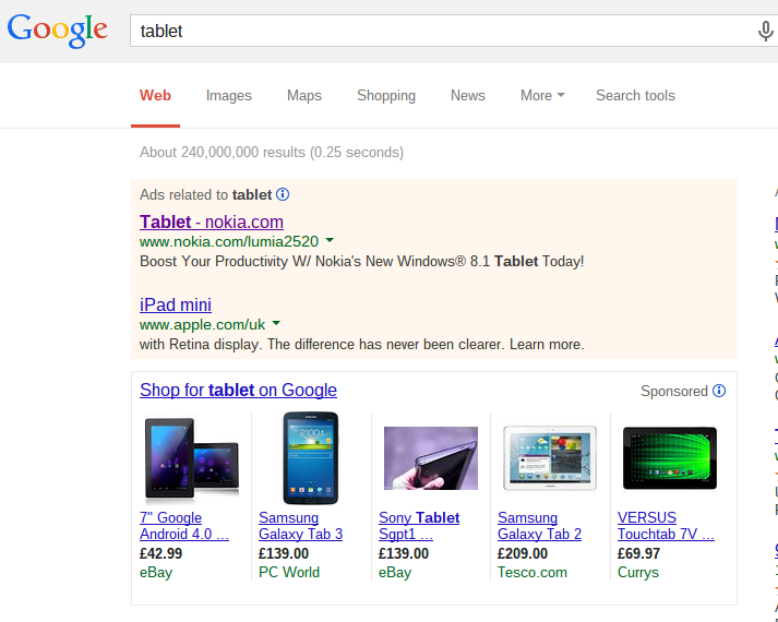
To see this, I typed in ‘tablet’ onto Google search UK:
What I first notice about the highest ranked PPC advert (being Nokia’s) is the extremely short title they have used. ‘Tablet – nokia.com’ is a pretty tragic title for the following reasons:
- It’s just too short. It does not make the web user want to click on the advert.
- ‘Tablet – nokia.com’? Seriously!? Is that all Nokia are going to mention? Not even the name of their tablet maybe like Apple have done below? How are they meant to get people talking about their tablet if they only mention the actual name of it only in the URL section?
- There is no call to action in the title which is highly recommended. Instead, they are relying on the description to increase the advert’s CTR.
For example, they could have had a title such as ‘Check out the new Window’s Tablet by Nokia’ or something which would actually encourage web users to click on the advert if the description was not there. Remember that a title is to grab the web user’s attention so that they then read the description and, to me, Nokia’s title does not do this.
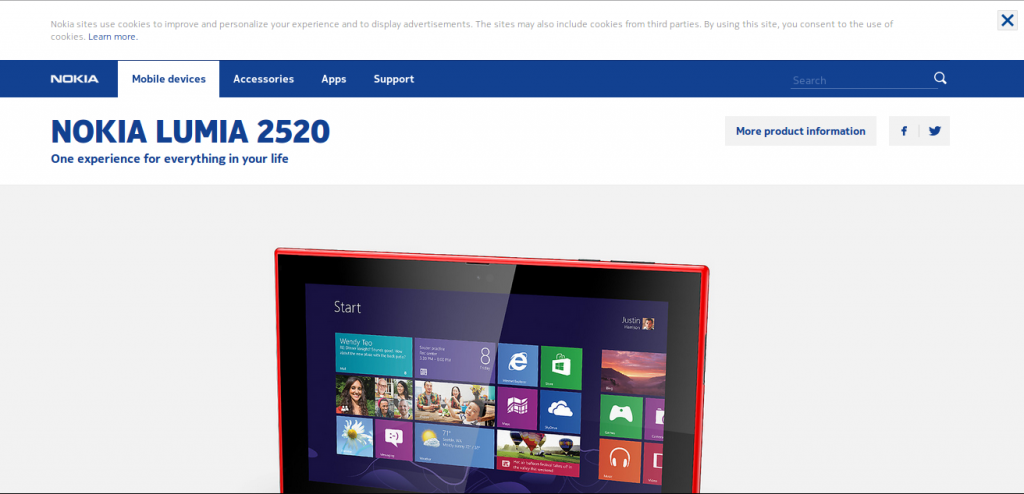
After clicking on Nokia’s search text advert, I came to the following landing page: My first thoughts on this landing page is that it is well optimised. This is because of the picture of the tablet. It is clear that web users have clicked on Nokia’s advert to check out their tablet. However, since the tablet is partly above the fold of the page, the landing page automatically makes the web user scroll down to see the tablet fully. This technique is brilliant because it then encourages the web user to keep scrolling down the web page which then goes through the features of the tablet like Apple does with their products.
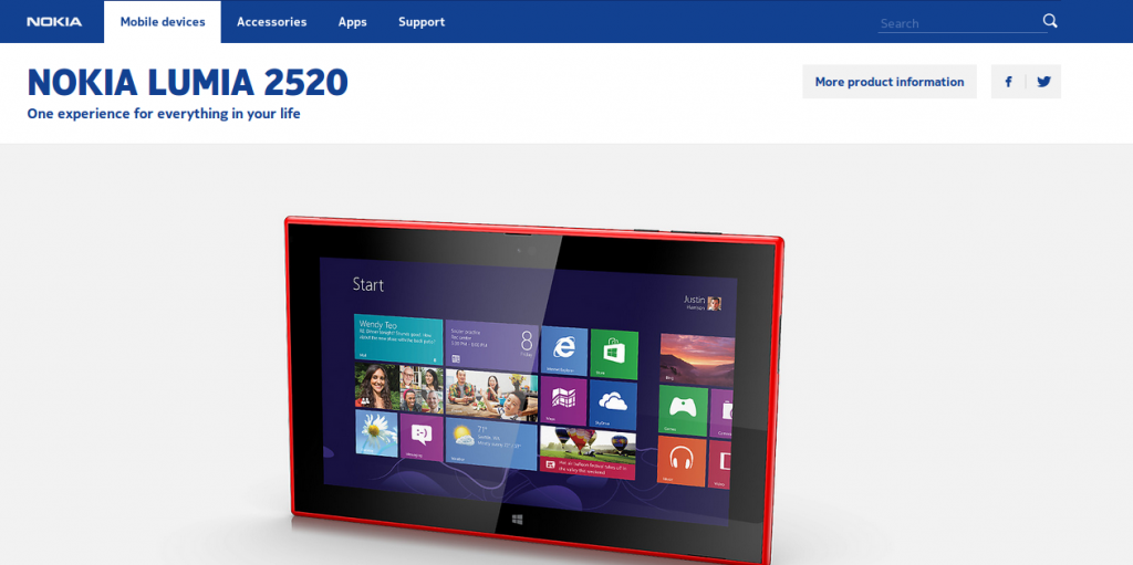
My second thoughts was that the reason the picture of the tablet is a little bit below the fold was because of the cookies message at the top of the landing page. Therefore, I got rid of the message and this is what the landing page then looks like: The fact of the matter is that the picture of the tablet is still a tiny bit below the fold. It is a clever technique by Nokia to do this because they are indirectly making the web user do what they want the web user to do without even asking them. This trick can be applied to your PPC landing pages too. For example, if you have a big button on your landing page, it is likely to be clicked. If you have a picture half below the fold, the web user is likely to scroll down to see the rest of the image and then continue scrolling. Therefore, make sure your landing page is optimised to what you want the web user to do. In Nokia’s case, they want the web user to scroll through the features of their tablet because they are using a product/service page.


