The last PPC campaign I analysed in the ‘Analyse A Real PPC Campaign’ series was from torfx, who had a search advert that had a few areas of improvement and a landing page that was very well designed to gain a lead capture and a click through onto a secondary landing page. With electric cars seemingly increasing in popularity, such as with upcoming models from Tesla, Chevrolet and Nissan, I thought it would be a good market to analyse a PPC campaign in. Therefore, without further ado, here is an analysis of a PPC campaign from Nissan, promoting their electric hatchback car: the Nissan Leaf.
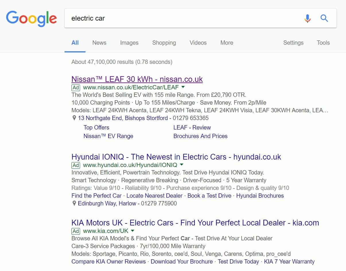
To view the Nissan Leaf’s PPC search advert, I had to type into Google search UK, ‘electric car’: Straight away, it is clear the CPC (cost per click) Nissan has adopted to promote the Leaf is high, considering the fact that they have the top paid search result placement. This is understandable as the electirc car market is still emerging. Therefore, it is a crucial time for all OEMs of electric cars to give their cars as much brand awareness as possible.
This point is validated by the title mentioning the car make alongside a reason to buy it (being the large battery capacity of 30 kWh). The description then goes into a lot of detail to provide the web user more information about the Leaf. For me, the description seems a bit cluttered, especially with the third line which does not look to be contributing much to the performance of this advert. The only reason Nissan, from my perspsetive, has gone for the three line description is to increase the size of the advert to push the third advert potentially below the fold, reducing competition for such a crucial keyword search phrase. I say this because the content is poor in the third description line and will not entice the web user further into a click. This point, though, is backed up by the use of the site link ad extension which further increases the size of the overall advert.
After clicking onto the above advert, I came to the following landing page: The first impressions of this landing page is not good at all, mainly for the following reasons:
- There are no images above the fold. This is a big no no. If you have stayed up to date with the ‘Analyse A Real PPC Campaign’ series, you will see that all successful campaigns always have some sort of image on the landing page, since images really are pleasant to look at and portray many things content cannot.
- It is obvious that this landing page is a product page, to promote the features of the Nissan Leaf. With this in mind, the areas that Nissan wants the web user to click onto is six links underneath ‘MODERN TECH THAT ENHANCES EVERY DRIVE’. However, they are not that large and do not immediately attract the web user’s attention. They should be made more colourful, larger in size and possibly bold to help guide the web user into clicking them.
The one good point to this above the fold landing page is that it is so boring and ‘non-existant’ that the only thing the web user can do is hope of content below the fold via scrolling, which is where the landing page improves dramatically with images, better content and better engagement.


You must be logged in to post a commentLogin